What is a Pivot Table? Perhaps, the PivotTable feature is the most key component in Excel. PivotTable is making one or more new tables from a given data table. This is the answer we shall search for in this article. We’ll answer this question by making PivotTables from fictitious data with an adequate number of proper illustrations.
What is a Pivot Table?
Pivot table is an interactive tool of Excel. Usually, we insert raw data in Excel and want to get output based on requirements. However, from raw data, it is difficult to get the desired result. So, we need to organize the raw data. Organizing data in Excel properly is a complex process. A pivot table is a solution for this complex work. We can organize data according to our requirements. A Pivot table can organize, summarize, and analyze data easily and present the out based on requirements.
Introduction to Dataset
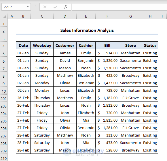
For clarification, we have a dataset for sales information of a super shop in our hands. Let’s start with the following figure. This figure shows a portion of the dataset we have used to create the pivot tables in this chapter. The table has 205 rows. Each row represents sales information with date, weekday, customer name, bill amount, store name, etc. in January and February.
The dataset has the following columns:
- The Date determines the date of sales.
- Weekday is for the corresponding day of the date.
- Customer represents the name.
- Cashier is the name of the biller.
- Bill represents the amount of transaction.
- Store is the branch name of the super shop.
- Status determines whether the customer is new or existing.
Why PivotTable Is Necessary
This database contains a good amount of information. But in its current form, the data doesn’t reveal much to you. The following questions the bank’s management may want to know:
- What is the total amount of sales, broken down by customer type and store?
- What are the daily total sales for each store?
- Which day of the week generates the most sales?
- How many new customers bought products at each store, broken down by month?
- How does the Manhattan store compare with the other three stores?
- In which branch do tellers open the most savings accounts for new customers?
You can sort the data and create formulas to answer these questions. But using a PivotTable is a better choice, a PivotTable takes a few seconds, requires a few clicks, doesn’t require a formula, and produces a professional-looking report.
Basically, you may do the following things using the PivotTable:
- Generating an overview of a huge dataset,
- Doing quantitative calculations such as sum, maximum, count, etc.
- Producing PivotChart with the created PivotTable,
- Filtering the entire dataset efficiently,
- Updating the PivotTable and the output with new data swiftly,
- Displaying timeline using Slicer and so on.
In addition, analyzing data with PivotTable makes fewer errors than creating formulas.
What Is Pivot Table in Excel: 3 Easy Steps
Now, we’ll create a PivotTable using the above-mentioned dataset. So, let’s explore the steps one by one.
Here, we have used Microsoft Excel 365 version, you may use any other version according to your convenience.
Step 01: Specify the Data Range
First, we’ve to select the specific range of data from which we want to create a PivotTable. It’s simple & easy, just follow along.
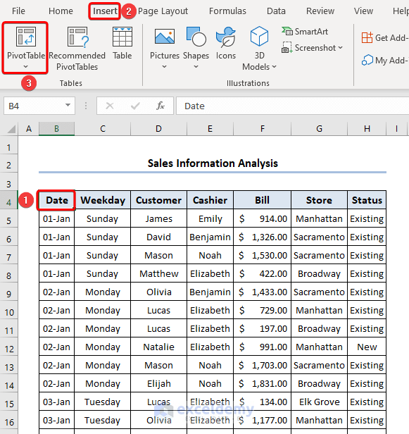
- At the very beginning, select any cell inside the dataset. In this case, we selected cell B4 in our dataset.
- Then, go to the Insert tab.
- Later, click on PivotTable on the Tables group.
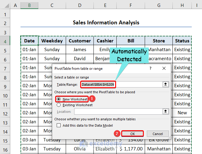
- Correspondingly, the PivotTable from table or range dialog box opens.
- Here, we can see that our data range was automatically detected and set in the Table/Range box.
- In the Choose where you want the PivotTable to be placed section, select New Worksheet. This will place our PivotTable in a new worksheet.
- After doing that, click OK.
Step 02: Create a Blank Pivot Table
As a result of our previous actions, Excel created a blank PivotTable in a new worksheet.
- Now, select any cell on the PivotTable. For example, we chose cell B4.
- Immediately, the PivotTable Fields task pane opens on the right side of the worksheet.
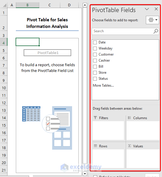
PivotTable Fields task pane has two parts: the upper part, where the field names reside, and the lower part, where you will place the upper part’s field names as per your necessity. In our example, the upper part of the PivotTable Fields task pane holds the Date, Weekday, Customer, Cashier, Bill, Store, and Status fields. The lower part has Filters, Columns, Rows, and Values area.
Step 03: Lay out the Pivot Table
Now, we shall work on the PivotTable Fields task pane. The following steps will create a simple PivotTable. So, follow along.
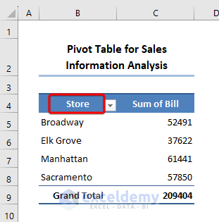
- Drag the Bill field into the Values The PivotTable will display the total of all the values in the Bill column.
- Drag the Store field into the Rows Now, The PivotTable will show the total Store for each of the Stores.
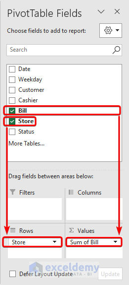
- And the final output looks like the following one.
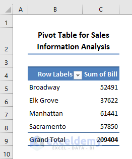
Getting Rid of “Row Labels” and “Column Labels” Headings
In the picture above, in cell B4, the heading shows Row Labels. But these are the Stores of the super shop. So, the heading should be Store. Therefore, we could change this to a PivotTable. Follow these simple steps.
📌 Steps:
- Firstly, select any cell inside the PivotTable.
- Secondly, go to the Design tab.
- In the Layout group, click on the Report Layout drop-down.
- Fourthly, select Show in Outline Form from the list.
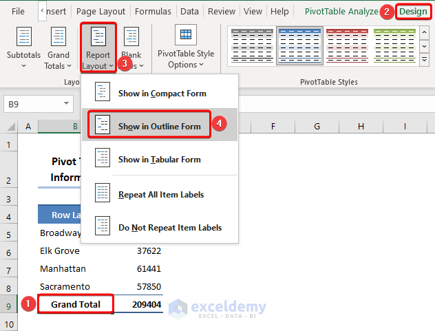
- At this moment, the heading in cell B4 changed magically.
Analyzing Data with Pivot Table
If you are curious to learn more about PivotTable, this section may come in handy. After creating a PivotTable, if you wish to conduct powerful data analysis, you might want to further enhance your PivotTable. Let’s go through the topics.
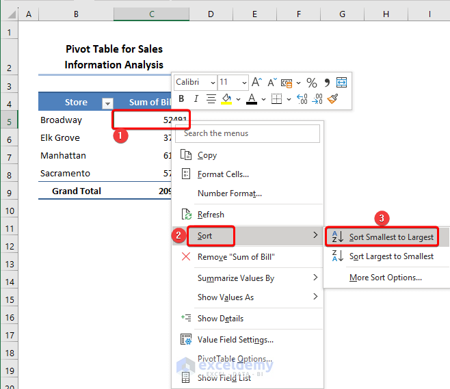
1. Sorting by Value
In the previous image, we saw the Sum of the Bill in descending order. Here, we can change the order by sorting. Let’s see the process.
📌 Steps:
- Initially, right-click on any Bill Here, we selected cell C5.
- Then, the context menu appears.
- After that, click on Sort from the menu.
- Later, select Sort Smallest to Largest on the sub-menu.
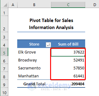
- Currently, the table looks like the one below.
2. Adding Second Value Field
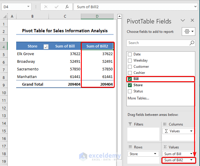
Also, you can include more than one field in the Values area. Besides, you can add the same field twice in the same area. For clarification, follow the steps.
- First, drag the Bill field again into the Values section.
- Thus, it will create a new column Sum of Bill2 in the table.
3. Showing Values as Percent of Total
In PivotTable, there are various options for showing values. If you want to show the Sum of Bill2 as a percentage of the Grand Total, you can do that easily. Allow me to demonstrate the process below.
📌 Steps:
- Primarily, right-click on cell D5 to open the context menu.
- Secondarily, click on Show Values As on the menu.
- Then, select the % of Grand Total from the sub-menu.

- Hence, we can see the result in the image below.
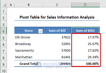
From the above image, we can see that the Manhattan branch made the highest stake of 29.34%.
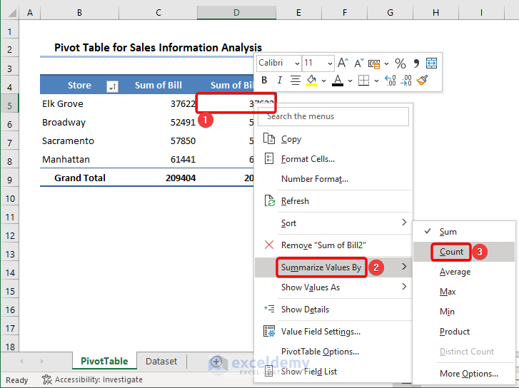
4. Changing Calculation in Value Field
Excel shows the summary in summation by default. But, we can change this factor. Just execute the steps below.
📌 Steps:
- First of all, right-click on cell D5 to open the context menu.
- Secondly, click Summarize Values By on the menu.
- Thirdly, select Count on the sub-menu.
You can do the same task in an alternative way.
- Similarly, open the context menu.
- Then, select Value Field Settings.
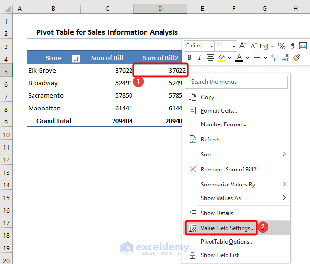
- Suddenly, it opens the Value Field Settings dialog box.
- Here, select Count in the Summarize value field by section.
- Lastly, click OK.
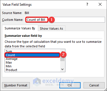
Thus, it exhibits the number of sales performed by the Store.

5. Using Group Feature
Here, we’ll talk about the Group feature of PivotTable. Let’s assume, we’ve got the Date field in the Columns area. Our dataset contains the information from 1st Jan to 28th Feb of 2023. So, the table would look like the one below.
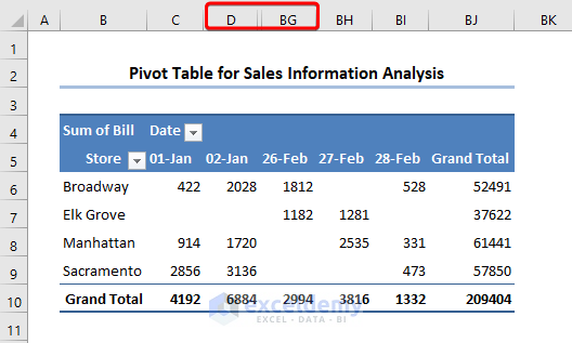
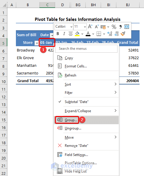
- Now, right-click on any Date (i.e. cell C5) to open the context menu.
- Then, select Group from the menu.
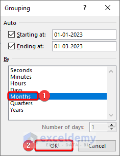
- Instantly, the Grouping wizard opens.
- Hence, select Months in the By section.
- Therefore, click OK.
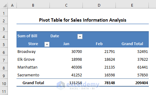
- Consequently, all the dates in January and February are grouped into two headings.
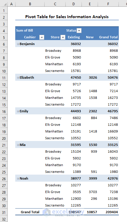
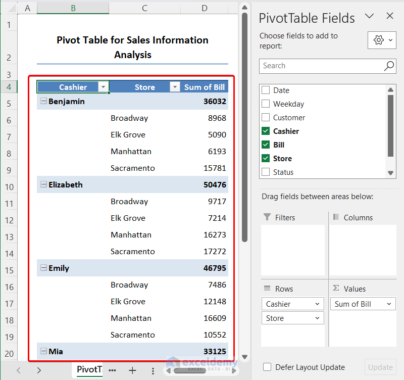
6. Creating Two-Dimensional PivotTable
For deeper analysis, you can construct a two-dimensional PivotTable. So let’s have a look at the procedure.
📌 Steps:
- To begin with, place the fields into the areas just like in the following image.
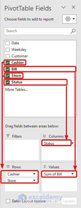
- As a consequence, it creates the following PivotTable.
It displays the breakdown of the Store to Cashier. Also, it shows the Status of the customer (i.e. Existing/New).
In a two-dimensional Pivot Table, we are nesting the areas. Here, we nested the stores with the cashiers. Here, we get the bills handled by each cashier in different stores separately.
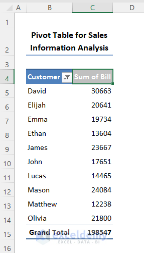
Determine Top 10 Values from Pivot Table
We can easily get the top 10 values using PivotTable in Excel.
📌 Steps:
- Drag Customer in Rows and Bill into Values section in the Pivot Table Fields section.
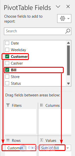
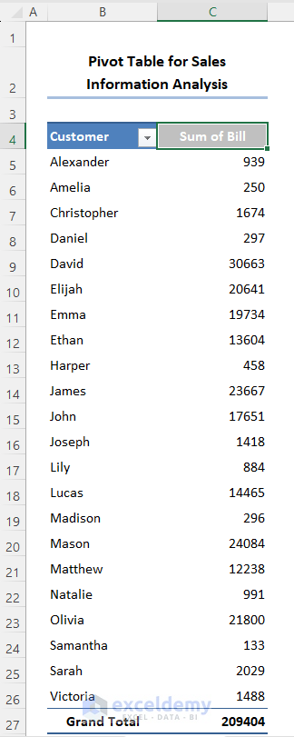
- Look at the dataset. We get all the bills with the customer names.
- Click on the filter option of the Customer heading.
- From the Value Filters select Top 10… option.
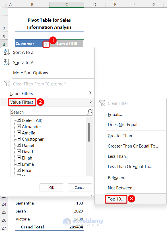
- A window appears. There, we can customize the value type, numbers of values, etc.
- Click on OK.
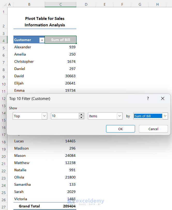
- We get the top 10 customers’ names with bills.
Add a Slicer in Pivot Table
The Slicer is one kind of button used to select any option or filter data in the Pivot Table. It is very useful and looks very interactive.
📌 Steps:
- First, we drag two fields: Cashier and Bill.
- Select Store and press the right button of the mouse.
- Choose to Add as Slicer option from the list.
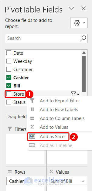
- We can see the Store is added as a slicer in the dataset.
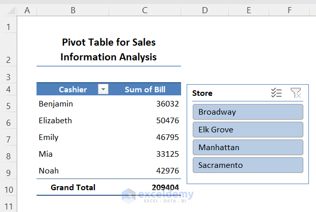
- Click on Broadway in the slicer and look at the worksheet.
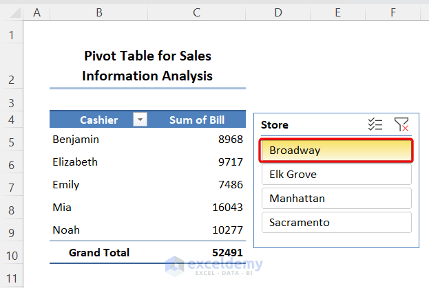
It shows only the sales of the Broadway store for each cashier.
Moving Pivot Table to New Location
To move a PivotTable to a new location, follow these simple steps.
📌 Steps:
- First, select cell B4.
- Then, move to the PivotTable Analyze tab.
- After that, click on the Actions drop-down group.
- Later, select Move PivotTable from the available options.
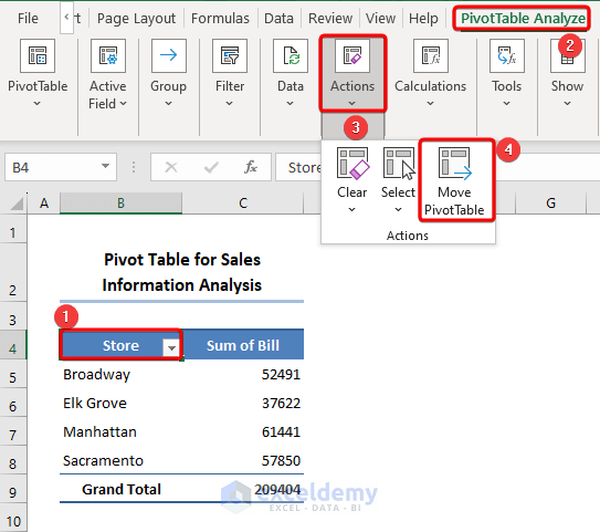
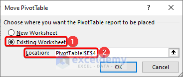
- Immediately, the Move PivotTable input box appears.
- Here, choose Existing Worksheet to place the PivotTable.
- In the Location box, give the cell reference of F4.
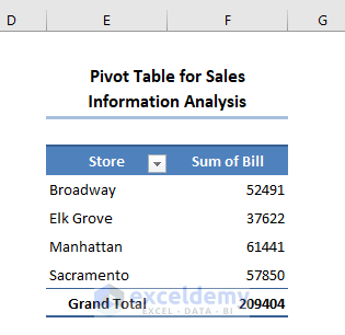
- Correspondingly, click OK.
- Clearly, we can see the table in its new location.
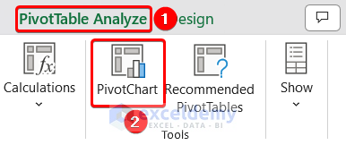
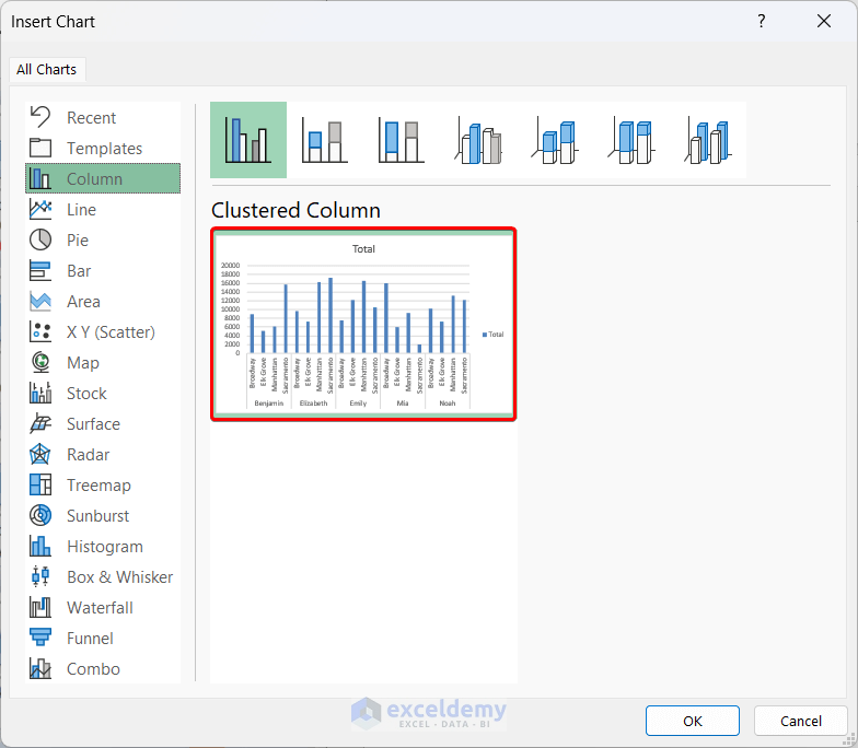
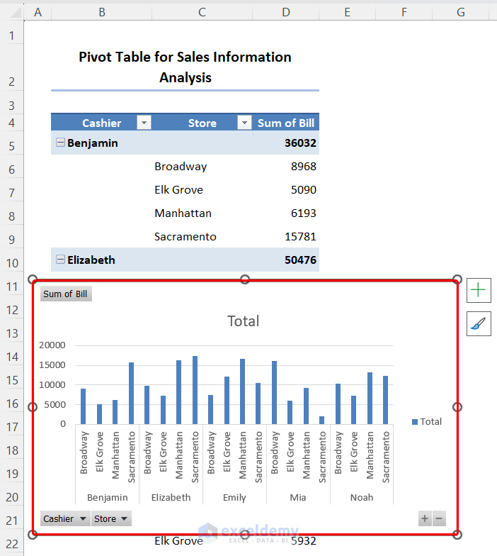
Make a Pivot Chart from Excel Pivot Table for Better Visibility
We know a chart is a good option to present data easily to the users. The pivot table also has the chart feature known as Pivot Chart. In this section, we will discuss how to make a Pivot Chart from a Pivot Table.
📌 Steps:
- First, we drag the required fields in the areas section.
We want to get the sales of each cashier based on different stores.
- Go to the PivotTable Analyze tab and click on the PivotChart option.
- Select the desired chart from the Insert Chart window.
- Finally, press the OK button.
- We get the Pivot Chart based on the data of the Pivot Table.
Deleting Pivot Table in Excel
Deleting the PivotTable is another easy job. Just follow us.
📌 Steps:
- In the first place, select any cell inside the table.
- Secondly, jump to the PivotTable Analyze tab.
- Then, click on the Actions drop-down group.
- After that, click on the Select drop-down.
- Next, choose Entire PivotTable from the options.
- Lastly, press the DELETE key on the keyboard.
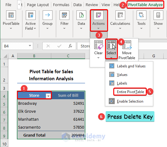
Thus, you can see your table was removed from the sheet.
Advantages of Pivot Table
- Lucidity: PivotTables are incredibly easy to create and modify. No need to learn challenging formulas.
- Formatting: Just as the data updates, a PivotTable may spontaneously assign a consistent number and design formatting.
- Agility: With a PivotTable, you can quickly produce a report that looks nice and is useful. Even if you are an expert with formulas, setting up PivotTables takes far less time and effort.
- Adaptability: PivotTables, as opposed to formulas, don’t force you to utilize a specific data view. You can simply adjust the PivotTable according to your requirements. Even better, you can duplicate a pivot table and create a different layout.
- Efficiency: You may be sure that the outcomes of a PivotTable are reliable as long as it is properly configured. In fact, it will frequently reveal issues with the data more quickly than any other method.
- Filtering: Numerous options for data filtering are included in PivotTables. Want to look at the Central and Westside branches, but not North County? It is quite simple with a PivotTable.
A Minor Drawback of Pivot Table
There is a minor drawback to using a PivotTable. In a formula-based summary report, the summary is updated automatically when you change information in the source data. But in PivotTable, the summary is not updated automatically when you change information in the source data. This is not a serious problem. Refresh your data source after changing information in your data source and the PivotTable will be automatically updated. To do this, follow us carefully.
📌 Steps:
- Firstly, select any cell inside the table.
- Then, proceed to the PivotTable Analyze tab.
- After that, click on the Data group drop-down.
- Later, select Refresh.
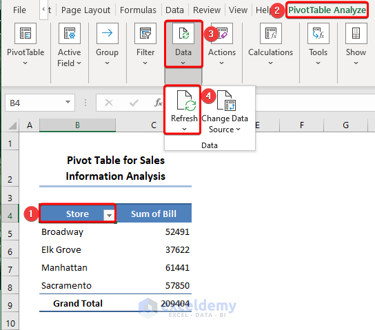
Simply, it’ll solve the problem of updating data.
Things to Remember
Make sure to remember some essential things while using PivotTable in Excel. You need to activate some options for your convenience in working. Don’t worry. Carefully follow the following steps.
📌 Steps:
- Firstly, select any cell inside the table. Here, we selected cell B4.
- Then, go to the PivotTable Analyze tab.
- After that, click on the PivotTable group drop-down.
- Later, select Options.
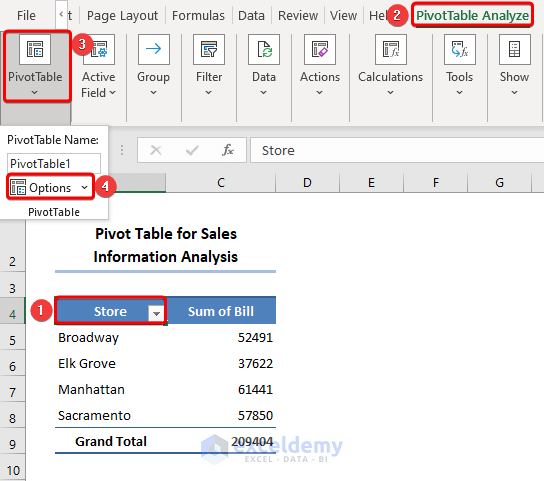
- Immediately, the PivotTable Options dialog box pops up.
- Here, check the boxes of these two options like in the following image.
- Correspondingly, click OK.
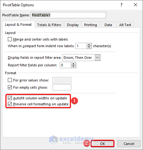
- Later, move to the Data tab in that dialog box.
- After that, make sure to tick the box of Refresh data when opening the file.
- Lastly, click OK.
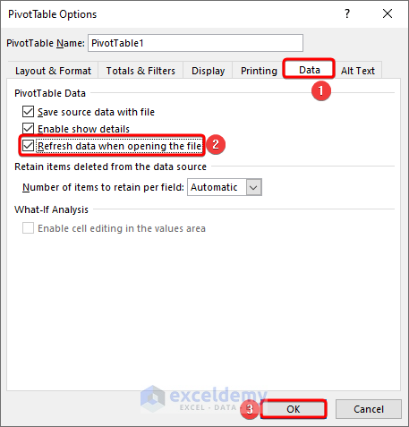
These will update your table when you open the file next time. Also, the first option will keep the Column Width changed according to the components in the cell. And, will preserve the formatting. So, don’t forget to check these tasks.
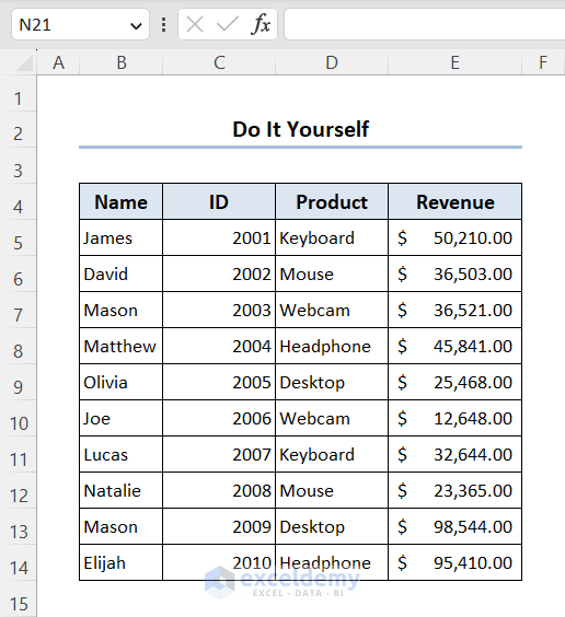
Practice Section
For doing practice by yourself we have provided a Practice section like below in the last sheet of the workbook.
Download Practice Workbook
You may download the following Excel workbook for better understanding and practice yourself.
Conclusion
Thank you for reading this article. I hope all of the information mentioned above about what is a Pivot Table? will now prompt you to apply them in your Excel spreadsheets more effectively. Don’t forget to download the Practice file. If you have any questions or feedback, please let me know in the comment section. Or you can check out our other articles related to Excel functions on this website.
What is Pivot Table in Excel: Knowledge Hub
- What Is the Use of Pivot Table in Excel
- Pivot Table Example
- A Pivot Table Example in Excel with Real Data
<< Go Back to Pivot Table in Excel | Learn Excel


thanks for the post. I just want to practice the guidance and I need the Excel file “Bank-accounts.xlsx”. Where can I download it?
Glad to know that it helps. The file is at the end of the article. Just click and download.