The box and whisker plot in Excel shows the distribution of quartiles, medians, and outliers in the assigned dataset.
This article will demonstrate how to create box and whisker plots in Excel with easy approaches. You will learn how to use a Stacked Column chart and apply the Box and Whisker chart option to create a box and whisker plot in Excel.
You will also learn how to create box and whisker plots with outliers and add average markers to a box and whisker chart in Excel. This article will provide you with information about the box and whisker plot components and their advantages.
Download Practice Workbook
You can download our practice workbook here for free!
What Is Box and Whisker Plot?
A box and whisker plot is used to examine the median, quartiles, maximum, and minimum values of a given dataset. A box and whisker plot consists of two parts: the box and the whisker. The rectangular box indicates the dataset’s Quartiles and Median. The bottom line indicates the first quartile, while the higher line represents the third. The median of the data set given is represented by the center line. A whisker is a vertical line that extends from the box. The lower and upper extreme points show the dataset’s Min and Max values.
What Are the Ways to Create Box and Whisker Plot in Excel?
We will discuss two ways to create a box and whisker plot by applying a stacked column and box and whisker chart in Excel. You will get a better idea of the box and whisker plot in detail.
How to Create Box and Whisker Plot Using Box and Whisker Chart?
In this part, we will create a box and whisker plot with the help of the common box and whisker chart from the available chart options.
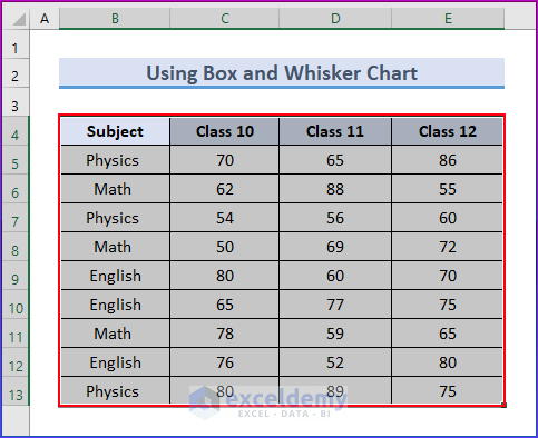
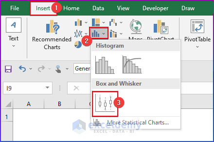
- Select the range of cells from B4 to E13.
- Now, go to the Insert tab in the ribbon.
- Then, select the Insert Statistic Chart drop-down option from the Charts group.
- Choose the Box and Whisker chart.
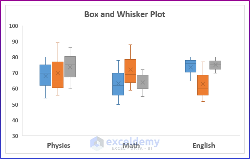
- As a result, you will see the Box and Whisker chart in the image below.
Read More: How to Make a Box and Whisker Plot in Excel?
How to Create Box and Whisker Plot Using Stacked Column Chart?
In this approach, we’ll make a box and whisker plot in Excel using the stacked column chart. The min, max, median, quartile 1, and quartile 3 must first be determined using the MIN, MAX, MEDIAN, and QUARTILE functions. Afterward, plot it using the stacked column diagram. Follow the steps to fully understand the method.
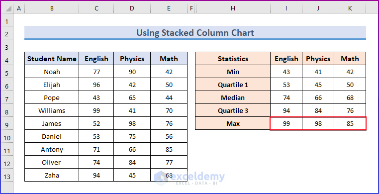
Step 1: Prepare Dataset
- First, prepare the data for a single record that contains numerous entries. We will generate additional information for the box and whisker charts using this dataset.
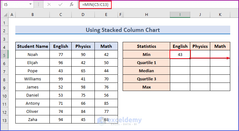
- First, select cell I5 and write down the following formula.
=MIN(C5:C13)- Press Enter. Next, move the Fill Handle icon to cell K5 by dragging it there.
Click on the image for a detailed view
- You will see the output in the image below.

Click on the image for a detailed view
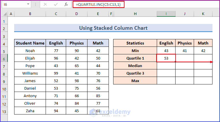
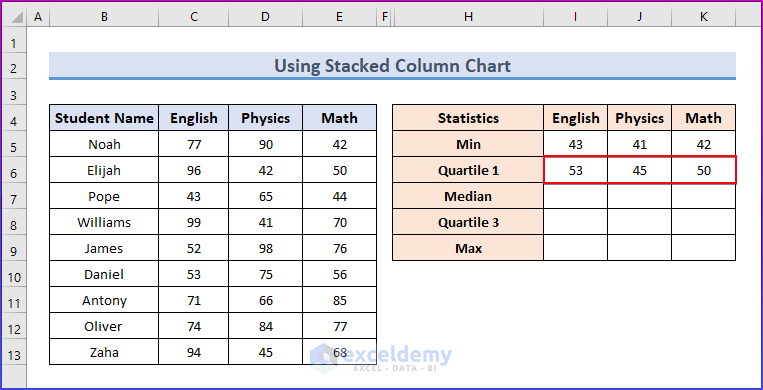
- Select cell I6 and write down the formula below.
=QUARTILE.INC(C5:C13,1)- Press Enter. Now, move the Fill Handle icon to cell K6 by dragging it there.
Click on the image for a detailed view
- You will see the output in the following image.
Click on the image for a detailed view
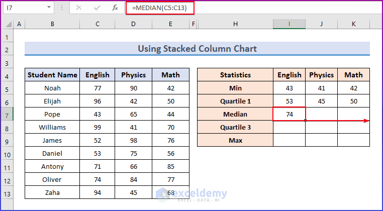
- Now, select cell I7 and insert the formula below.
=MEDIAN(C5:C13)- Press Enter and move the Fill Handle icon to cell K7 by dragging it there.
Click on the image for a detailed view
- You will get the result here.
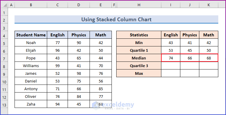
Click on the image for a detailed view
- Insert the following formula in cell I8.
=QUARTILE.INC(C5:C13,3)- Press Enter. Now, drag the Fill Handle symbol to cell K8.
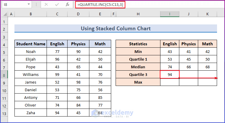
Click on the image for a detailed view
- The outcome is available here.
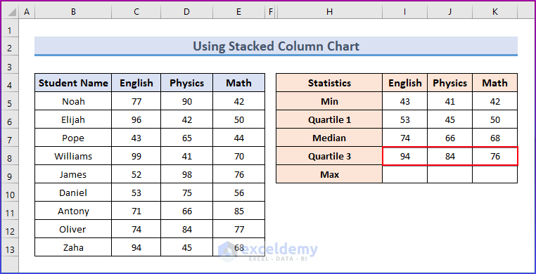
Click on the image for a detailed view
- Insert the following formula in cell I9.
=MAX(C5:C13)- Press Enter. Now, drag the Fill Handle symbol to cell K9.
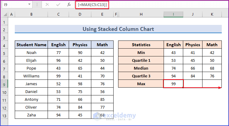
Click on the image for a detailed view
- The results are displayed in the image below.
Click on the image for a detailed view
The five number statistics have now been completed. To identify the differences, we must also generate another comparable table.
- For the minimum value, we will use the following function.
=MIN(C5:C13)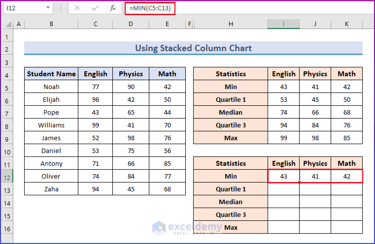
Click on the image for a detailed view
- To determine the difference for Quartile 1, use the following formula.
=I6-I12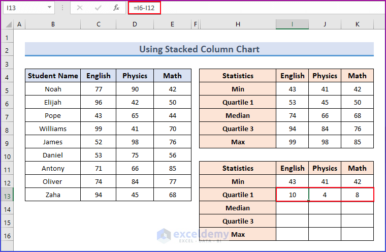
Click on the image for a detailed view
- To determine the difference for the Median, insert the following formula.
=I7-I6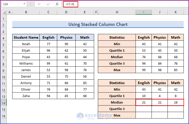
Click on the image for a detailed view
- To find the difference for Quartile 3, apply the following formula.
=I8-I7
Click on the image for a detailed view
- To know the difference for the Maximum value, use the following formula.
=I9-I8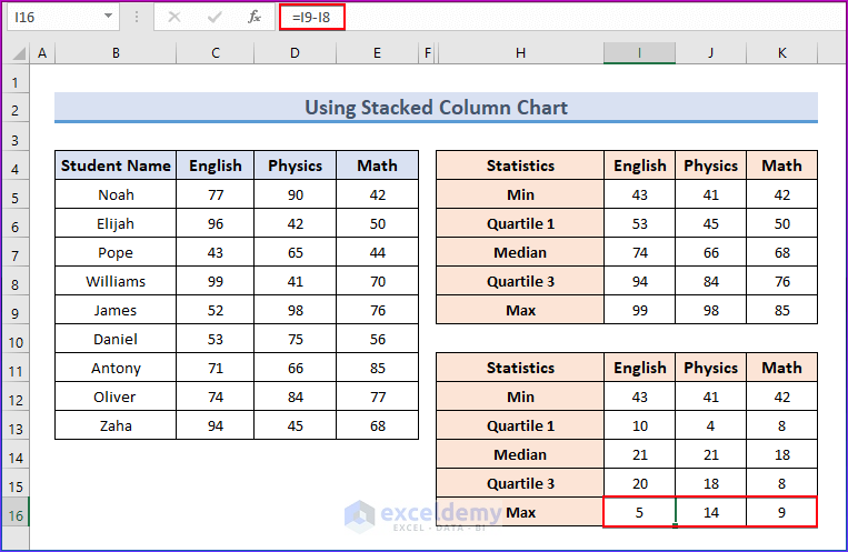
Click on the image for a detailed view
Step 2: Insert Stacked Column Chart
- To make a stacked column chart, select the range of cells from I11 to K16.
- Then, go to the Insert tab in the ribbon.
- From the Charts group, select Insert Column or Bar Chart.
- Now, choose the Stacked Column chart.
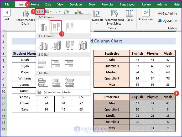
Click on the image for a detailed view
- Now, we will get the following chart.
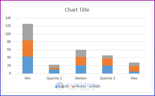
- Right-click on the chart.
- Choose Select Data.
- Click on the Switch Row/Column.
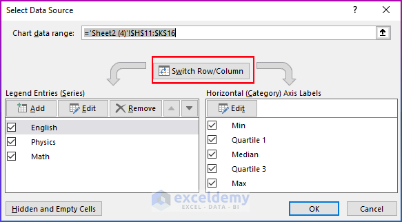
- Now, click OK.
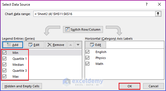
- Here, you will see that the chart has been switched.
Step 3: Customize Chart
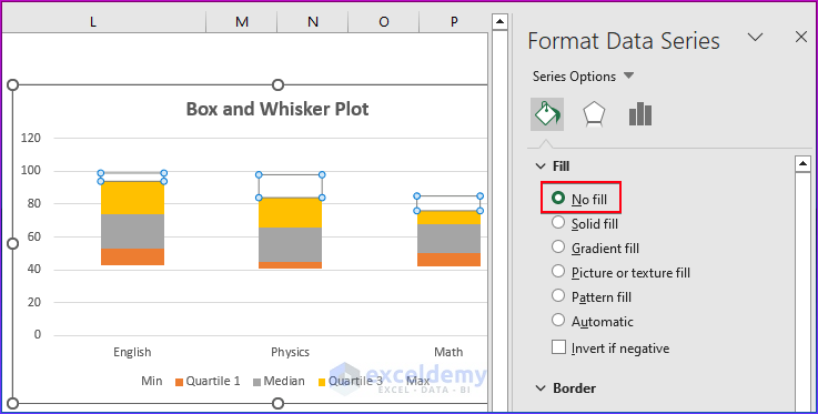
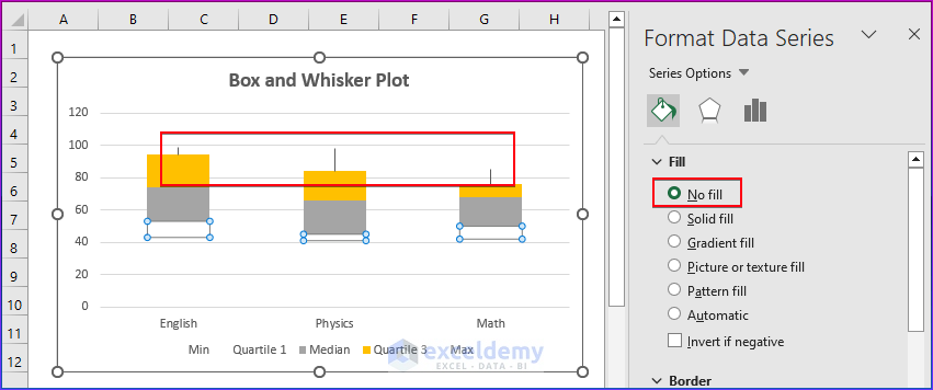
- Right-click on the lower part of the chart.
- Choose Format Data Series.
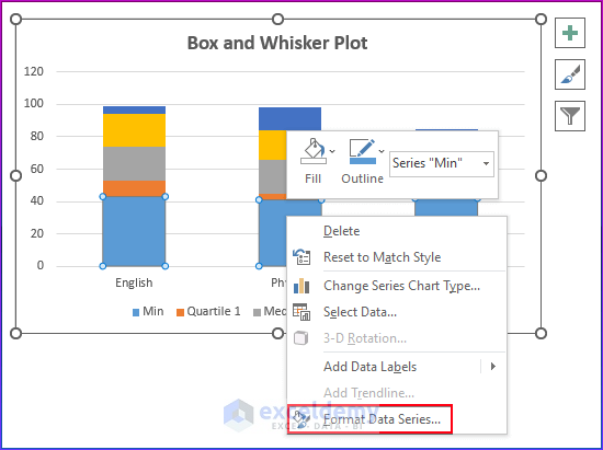
- We will select No Fill.
- As a result, the bottom bar is no longer visible on the graph.
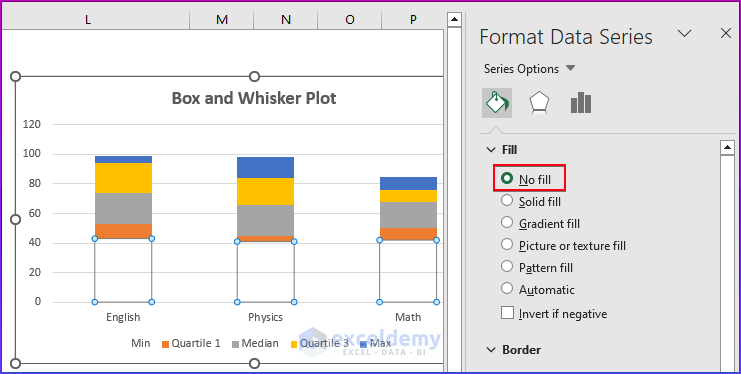
- The box diagram is done. The whiskers for these boxes must then be made.
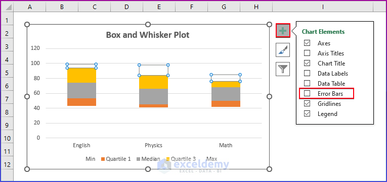
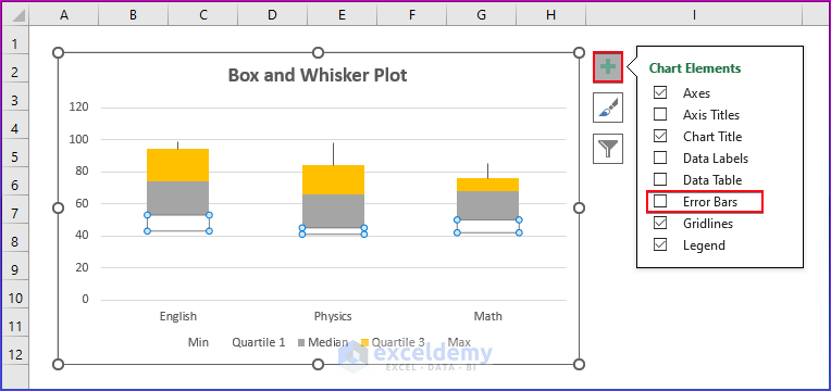
- We will select the top bar of the chart.
- Then, choose No Fill.
- Now, select the Error Bars from the Chart Elements by selecting the same bar.
Click on the image for a detailed view
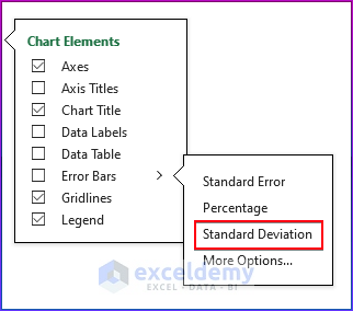
- Choose the Standard Deviation.
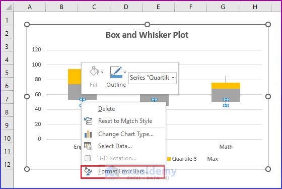
- Right-click on the error bars.
- Select Format Error Bars.
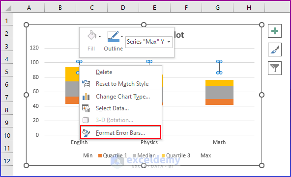
- Here, we will make the following changes.
- Select Minus in Direction option, No Cap in End Style option and keep the percentage at 100% in Error Amount.

- The whisker lines will now appear in the following image.
- Choose No Fill by selecting the bottom bar.
Click on the image for a detailed view
- Now, select the Error Bars from the Chart Elements by selecting the same bar.
Click on the image for a detailed view
- Choose the Standard Deviation.
- Right-click on the error bars.
- Select Format Error Bars.
- Here, we will make the following changes.
- Select Minus, No Cap, and keep the percentage at 100%.
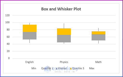
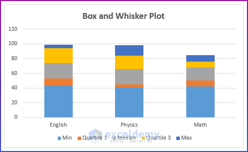
- Now, Our Excel box and whisker chart will appear in the following image.

How to Add Average Marker to Box and Whisker Plot in Excel?
In this section, we will add the average marker to the box and whisker charts. You must follow the previous method, where we showed how to make a box and whisker plot chart by using the stacked column chart.
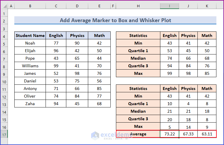
- To add an average marker, find the average in the data range of the box plot.
- To determine the average for the data ranges, enter the AVERAGE function in cell I17.
=AVERAGE(C5:C13)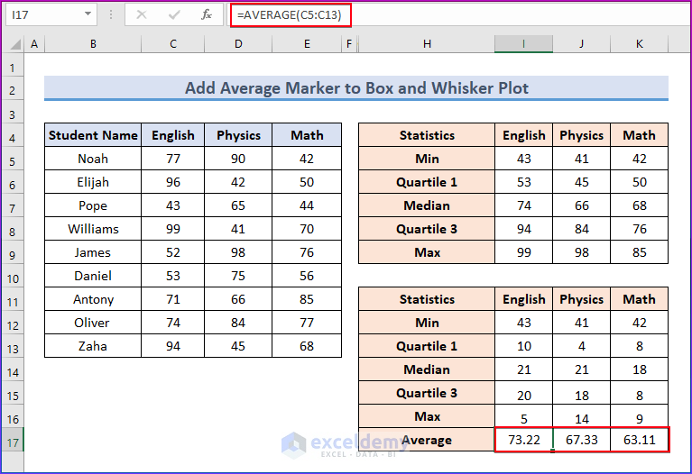
Click on the image for a detailed view
- Copy all of the cell values as well as the cells with the Average label.
Click on the image for a detailed view
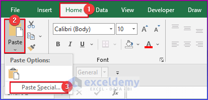
- Click on the chart, then select the Paste button on the Ribbon’s Home tab.
- Click Paste Special.
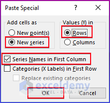
- Select “New Series“, “Values in Rows,” and “Series Names in First Column” in the Paste Special dialog box, then click OK.
- Here, the Average series shows as a Stacked Column.
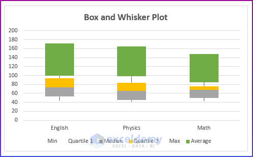
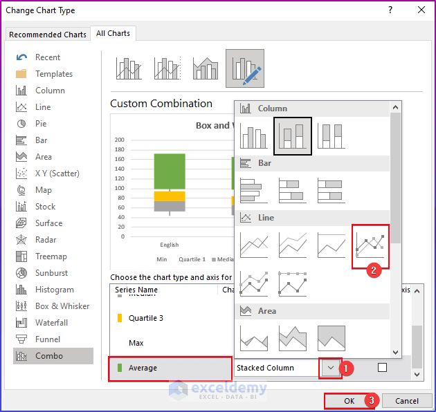
- Click Change Series Chart Type from the context menu by right-clicking one of the columns.
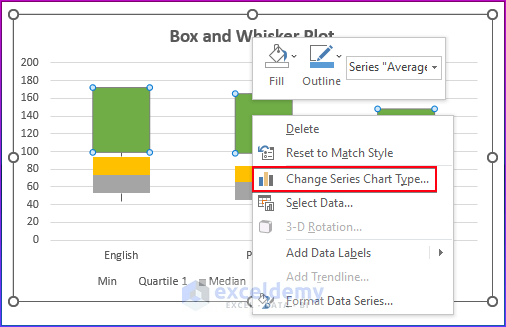
- In the Change Chart Type dialog box, choose the Combo Find the Average in the list of series, change its chart type to Line With Markers, and then click OK.
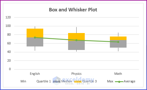
- This is the following output of the line with average markers
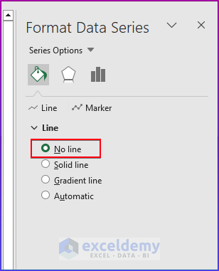
- Right-click on the average line.
- Choose Format Data Series.
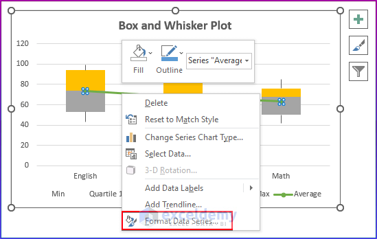
- Select No Line.
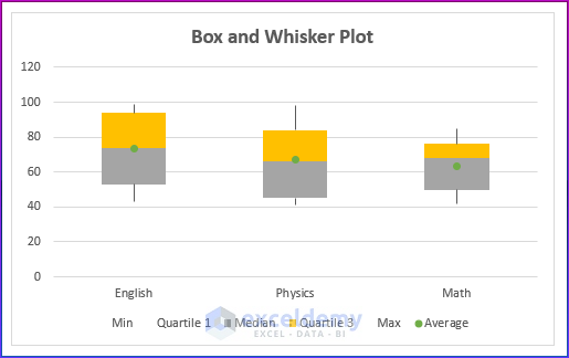
- Now, our final box and whisker plot chart with an average marker will look like this.
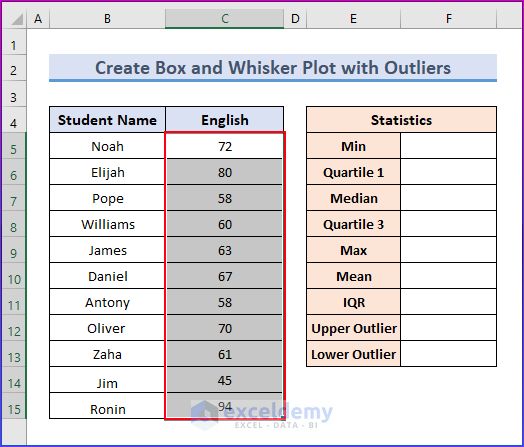
How to Create Box and Whisker Plot with Outliers in Excel?
In this section, we will create a box and whisker chart with outliers.
- Select the range of cells from C5 to C15.
- Now, go to the Insert tab in the ribbon.
- Then, select the Insert Statistic Chart drop-down option from the Charts group.
- Choose the Box and Whisker chart.

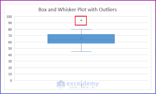
- Finally, you will see the box and whisker plot chart with outliers.
Now, if you want to know the value of the Lower outlier and Upper outlier, you need to calculate the Minimum value, Median, Quartile 1, Quartile 3, Maximum value, Mean value, and Inter Quartile Range (IQR).
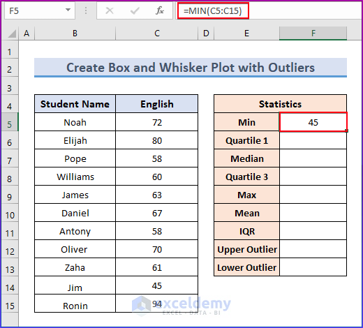
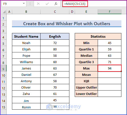
- Write down the following formula in cell F5.
=MIN(C5:C15)- Click Enter to see the result.
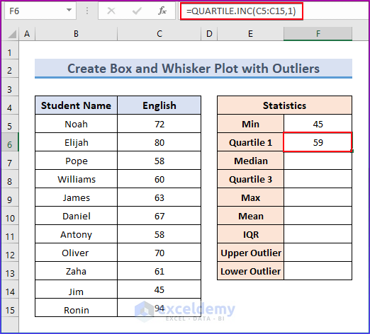
- Insert the following formula in cell F6.
=QUARTILE.INC(C5:C15,1)- Press Enter to see the result.
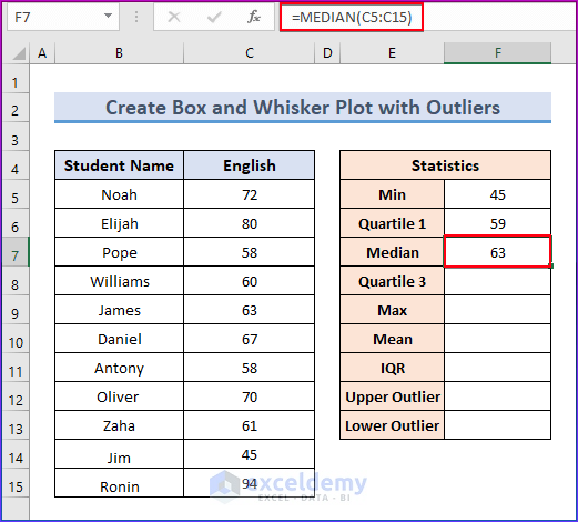
- Insert the following formula in cell F7.
=MEDIAN(C5:C15)- Press Enter to see the result.
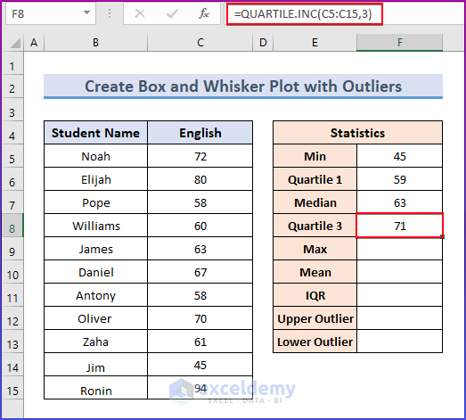
- Type the following formula in cell F8.
=QUARTILE.INC(C5:C15,3))- Hit Enter to see the output.
- Write down the following formula in cell F9.
=MAX(C5:C15)- Hit Enter to see the output.
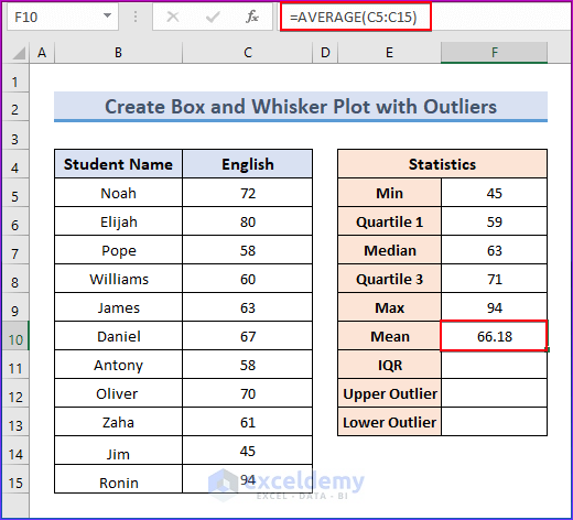
- Write down the following formula in cell F10.
=AVERAGE(C5:C15)- Press Enter to see the result.
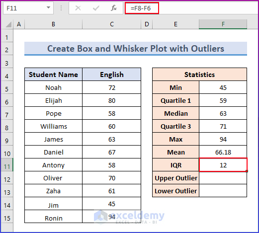
- Write down the following formula in cell F11 to find the interquartile range.
=F8-F6- Press Enter to see the result.
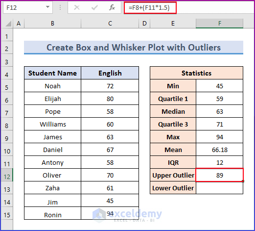
- Insert the following formula in cell F12 to find the Upper outlier.
=F8+(F11*1.5)- Press Enter to see the output.
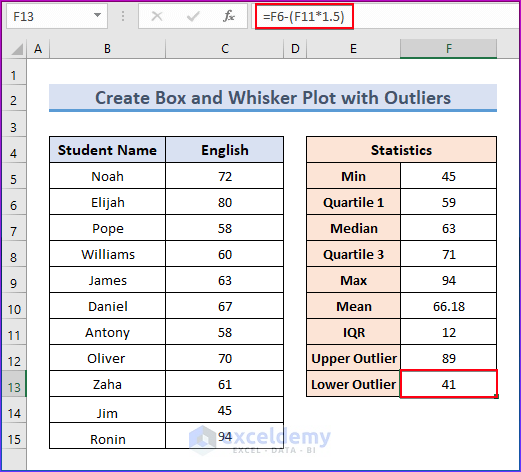
- Insert the following formula in cell F13 to find the Lower outlier.
=F6-(F11*1.5)- Press Enter to see the output.
Things to Remember
- Box and Whisker charts are not available in all Excel versions. They made their professional appearances in Excel 2016, Excel 2019, and Excel 365. You might need to use a different method to create box plots if you’re using an old version, or you could update it.
- Make sure that your data is properly arranged in rows or columns.
Conclusion
In this article, we have shown simple ways to create box and whisker plots in Excel by giving multiple examples with proper explanations. We have shown how to make a box and whisker plot in Excel by using a stacked column chart and the box and whisker chart option.
Additionally, you will discover how to make box and whisker plots using outliers and how to add average markers to an Excel box and whisker chart.
Each method has advantages and is appropriate for different situations. You can browse our website and check our knowledge hub section for more valuable and informative articles about how to create box and whisker plots in Excel.
Frequently Asked Questions
1. Is it possible to make a box and whisker plot in previous versions of Excel?
Box and whisker charts are accessible in later versions of Excel, such as Excel 2016. If you have an older version of Excel, such as Excel 2013 or earlier, the built-in feature to make box and whisker plots may be missing. In such circumstances, you can either upgrade to a newer version of Excel or use alternative software or web tools created expressly for making box and whisker plots.
2. Can I make a box and whisker plot with many data sets in Excel?
Yes, you can make a box and whisker plot in Excel using various data sets. When constructing the chart, simply include data from all of the sets in your selection. Each data set will be depicted on the chart as a separate box and whisker plot, allowing for easy comparison.
3. What if my data has negative values?
If your data includes negative values, the Box and Whisker Plot will handle them just like positive values. The box will still represent the interquartile range, and the whiskers will extend accordingly.
Box and Whisker Plot in Excel: Knowledge Hub
<< Go Back to Excel Charts | Learn Excel

