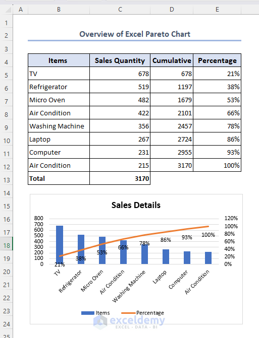
In this article, you will learn about the Excel pareto chart and how to add this chart in Excel. You can also gain knowledge of cumulative percentage, advantages, and limitations of pareto chart as well.
A Pareto chart is a type of chart that combines a bar graph and a line graph to analyze data and identify the most significant factors contributing to a problem or outcome.
Download Practice Workbook
You can download this practice workbook while going through the article.
How to Create a Pareto Chart (Step by Step)
Step 1: Calculate Cumulative Percentage
To create a Pareto chart,
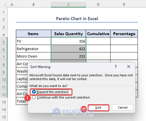
- First, select range C5:C12 and go to Home >> Editing >> Sort & Filter.
- Choose the Sort Largest to Smallest option.

- Select Expand the selection option from Sort Warning.
- Click on Sort.
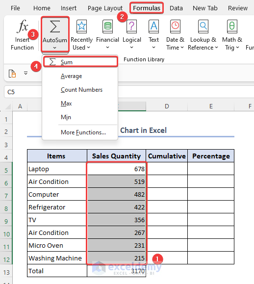
- Select the entire sort column, range C5:C12 and go to Formulas >> Autosum >> Sum.
- You will find the sum in cell C13.
- Apply the following cumulative formula in cell D6.
- Use the Fill handle to insert the entire column.
=C6+D5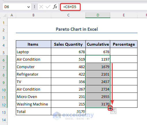
- Apply the following formula in cell E5 to get fraction value.
=D5/$C$13- Use the Fill handle to insert the formula into the entire column.

We used the $ sign to make the Total cell static.
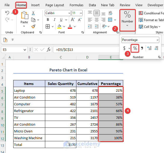
- To convert into percentage format go to the Home tab.
- Expand the Number bar and select the Percentage option.
- You will find the percentage format added to the desired column.
Step 2: Plot a Pareto Chart
To add the Pareto chart,
- Select the desired columns that you want to show in the chart. Here we select ranges B4:C12 and E4:E12.
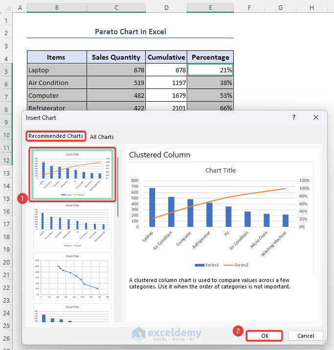
- Go to the Insert tab and select the Recommended Charts option.
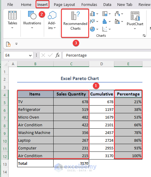
To select an inconsistent column range press CTRL and select desired columns.
- Select the desired chart and click on OK.
Step 3: Add Data Labels
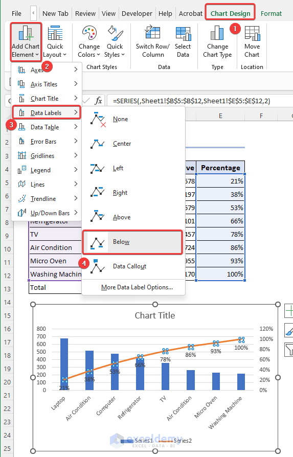
To insert the data label,
- Click on the Line chart and go to the Chart Design tab.
- Click on the Add Chart Element option.
- Expand the Data Labels bar and select the Below option.
- You will find the values labeled for the particular points.
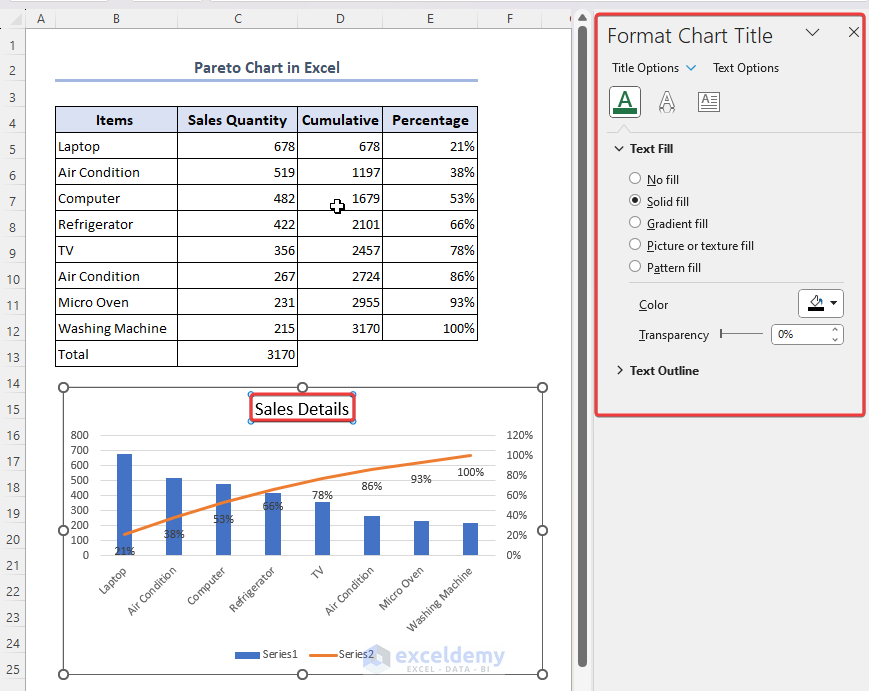
Step 4: Format Chart
You can format your chart as per your requirement,
- Click on the chart title to edit it and provide a new title according to the data.
- You can also change the color, size transparency, etc. from Format Chart Title section.
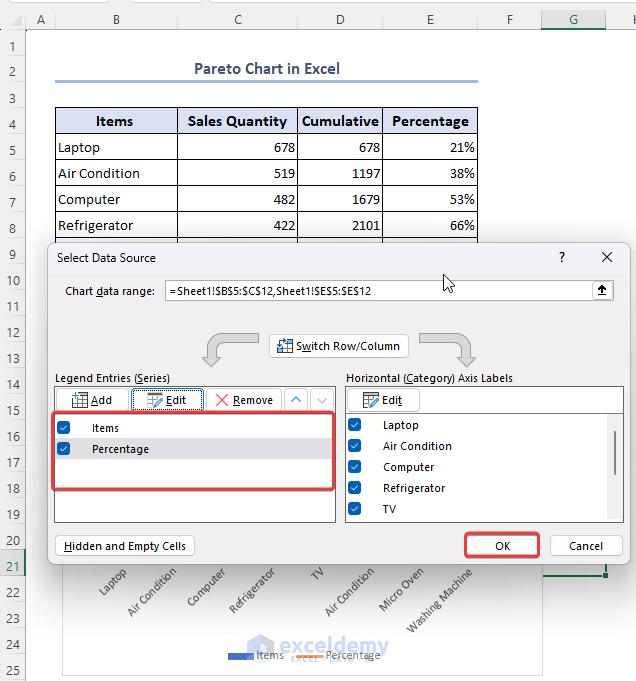
- You can also modify the legend of the chart.
- To do so, go to the Select Data Source option. You will find the option by selecting the legend and clicking on the right.
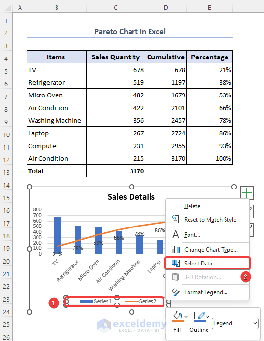
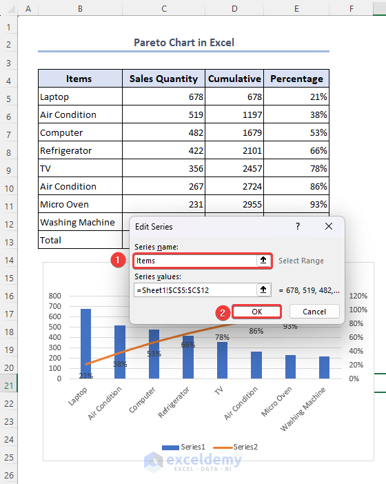
- Select each legend and go to the Edit option.
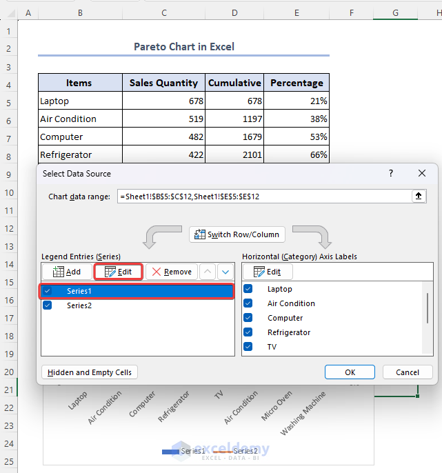
- Change the name and value as per your requirement and click on OK.
- By following a similar process you can change the other legend as well.
- Click on OK.
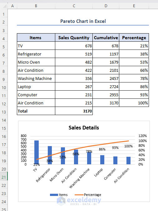
- By customizing the chart as per your requirement finally, you will get the desired result.
Read More: How to Make Pareto Chart in Excel
Advantage of Pareto Chart in Excel
There are some advantages of using a Pareto chart over other Excel charts, which are as follows:
- The Pareto chart improves decision-making in a process.
- The Pareto chart identifies and highlights the main cause of the problem.
- It arranges the vertical bars of the Pareto chart in descending order. So, the users can easily find and resolve the biggest problem first by finding it at the top and placing the highest to lowest priority.
- Several skills such as – problem-solving skills, decision-making skills, data analysis skills, time management, and more are developed by using the Pareto chart.
- It is a time-saving option and efficient to use.
Limitations of Pareto Chart in Excel
- The Pareto chart does not provide the root cause of the problem.
- A single cause or a reason category may have other factors involved, so to find the major impact at each level of the problem, we have to create many Pareto charts.
- The Pareto chart shows the problem based on the frequency distribution.
- The Pareto chart cannot be used to determine how serious the problem is or how much a procedure would need to modify to return to specification.
Frequently Asked Questions
1. Can I customize the appearance of a Pareto chart in Excel?
Yes, you can customize the appearance of a Pareto chart in Excel. After generating the chart, you may change its type, alter the axis labels, add titles and data labels, change the color scheme, and format the bars and lines, among other changes. Excel provides a range of formatting options to help you customize the chart to your preferences or to align it with your presentation needs.
2. What is the purpose of a Pareto chart in Excel?
The purpose of a Pareto chart in Excel is to identify and prioritize the most significant factors or issues based on their relative frequency or impact. It helps in visualizing the Pareto principle, which states that a small number of causes or factors contribute to a large majority of the problems or effects. By using a Pareto chart, you can focus your efforts on addressing the vital few issues that have the greatest influence, leading to more efficient problem-solving and resource allocation.
3. Can I update the data in a Pareto chart after creating it in Excel?
Yes, you can update the data in a Pareto chart after creating it in Excel. Simply modify the data range of the chart by selecting the chart, right-clicking, and choosing Select Data from the context menu. From there, you can edit the data series or add/remove data points as needed.
Things to Remember
- Before creating a Pareto chart you have to categorize the issues.
- The percentage must be on the Y-axis.
- It is a past data analysis and does not provide a forecast analysis.
Conclusion
We believe the Excel Pareto chart article will help you to create the chart during problem-solving issues. You will also be able to format and customize the chart efficiently as per your requirement. To learn more about it you can go through the knowledge hub section. If you have any confusion, feel free to comment below.
Excel Pareto Chart: Knowledge Hub
<< Go Back to Excel Charts | Learn Excel

