In this article, we will create a surface chart in Excel. There are four types of surface charts and here we will discuss about 4 of them. Here, we will also learn about the uses of surface charts. After learning details about surface charts we will also learn how to create radar charts and doughnut charts.
Charts are quite helpful when you need to show the characteristics of your dataset to someone else. Surface charts help you see the condition of the dataset in a 3-D way, which gives you more accuracy while analyzing the dataset, and the outputs are more accurate.
Download Practice Workbook
You may download the below workbook for practice.
How to Create Surface Chart in Excel: 4 Ways
In this part, we will create different types of surface charts in Excel.
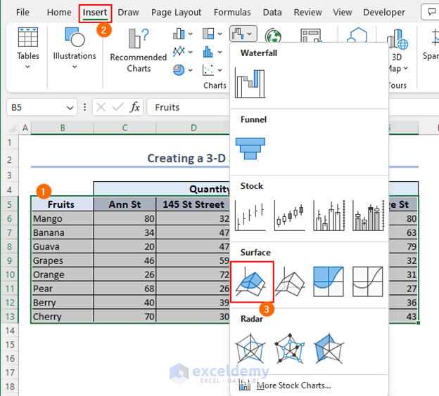
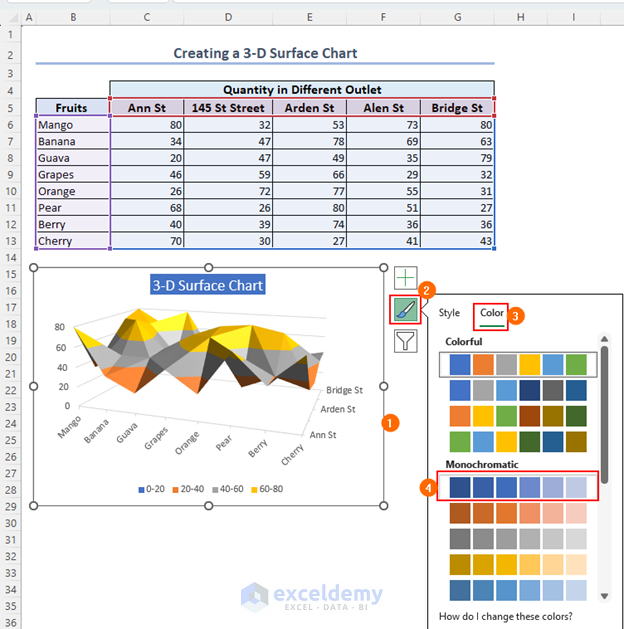
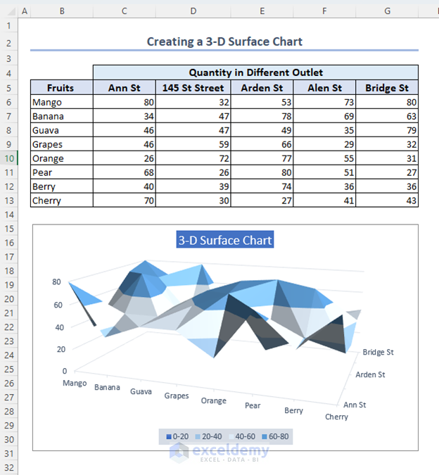
1. Creating a 3-D Surface Chart
Therefore, in this method, we will create a 3-D surface chart in Excel.
- Initially, go to Insert Tab >> Surface Chart >> 3-D Surface as below.
- Now, select the chart, go to Edit >> Color, and select a monochromatic color for better virtualization.
- Now, the final output will be similar to the one below.
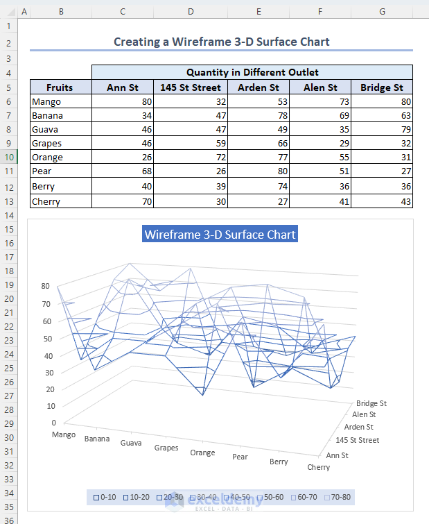
2. Creating a Wireframe 3-D Surface Chart
Here, we will create a wireframe 3-D surface chart in Excel. This process is quite similar to the previous process. Just select Wireframe 3-D Surface Chart instead of 3-D Surface Chart.
3. Creating a Contour Surface Chart
The contour surface chart is quite different and important. Now we will create this chart. This is another type of surface chart if you select Contour Surface Chart from the Surface chart drop-down box then you get this chart.

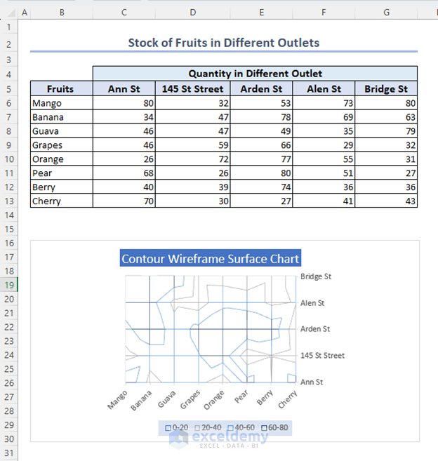
4. Creating a Wireframe Contour Surface Chart
In this method, we will create the wireframe contour surface chart. This is another surface chart. The procedure this quite similar to the previous methods. Select Wireframe Contour surface Chart to execute this process.
What are the Uses of the Surface Chart in Excel
There are some uses for surface charts in Excel. Follow the below points to learn the uses of this chart.
- Sometimes the datasets are complex and confusing at the same time. A surface chart is a 3-D chart and always shows the output without any overlap in a mess surface.
- The Xcolor pallet of the chart shows the data with a similar range. So, you get to know the characteristics of the dataset which helps to analyze the dataset as well.
- You need a surface chart when you need to find the optimum conditions for two sets of data.
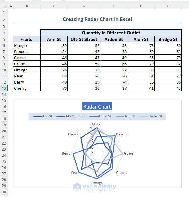
How to Create a Radar Chart in Excel
Here we will create a radar chart using the same process as the surface chart. This chart is important if you want to see which data are on the selected radar and which data cross the radar.
- Select Insert >> Radar Chart >> Radar to create Radar Chart in Excel
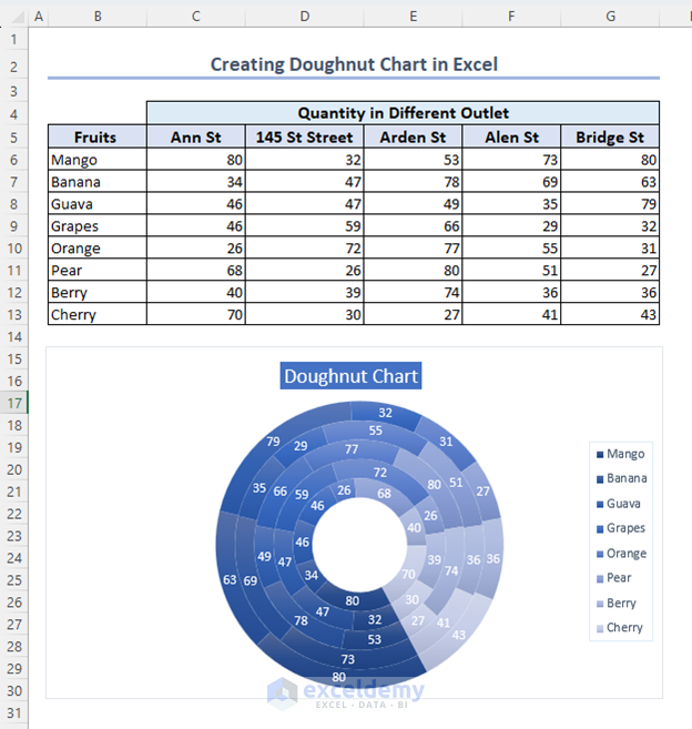
How to Create Doughnut Chart in Excel
Therefore, in this method, we will create a doughnut chart in Excel to analyze the dataset.
- Initially, select Insert >> Insert Pie or Doughnut Chart >> Doughnut Chart to create a doughnut chart.
Things to Remember
- Always select the correct range while working on the charts. Otherwise, the chart will reflect the output of the wrong range.
- Select a surface chart while working on a complicated dataset. It will show you the 3-D version of the graph. Otherwise, sometimes the 2-D version shows you the wrong navigation. Overlaps data and looks bad in print.
Frequently Asked Questions
Q1: What is a surface chart in Excel?
Ans: A surface chart is a chart that represents three-dimensional data plots. Different types of surface charts represent different situations.
Q2: How do I create a surface chart in Excel?
Ans: To create a surface chart select the dataset go to Insert >> Select Chart >> Select Surface Chart from the toolbar.
Q3: What is the function of the surface chart?
Ans: A surface chart is used when you need to analyze the data in a 3-D format on a rough surface.
Conclusion
Here, we learned how to create surface chart in Excel in different patterns. Here we also learned about the uses of surface charts and how to create radar charts and doughnut charts as well. In this article, we covered every possible way to identify and solve this error. Hopefully, you can solve the problem shown in this article. Please let us know in the comment section if there are any queries or suggestions, or you can also visit Exceldemy to explore more.
<< Go Back To Excel Charts | Learn Excel

