In this Excel tutorial, you will learn how to
-Create a thermometer chart/goal thermometer
-Create a twin thermometer chart
We have used Microsoft 365 to prepare this tutorial. You can use these methods in Excel 2021, 2019, 2016, and 2013.
A thermometer chart is also known as a progress chart or a goal chart. It shows progress towards a goal or target. Moreover, it provides a clear indication of how close you are to achieving the target. It really helps to monitor and assess progress at a glance.
Download Practice Workbook
How to Create a Thermometer Chart/Goal Thermometer in Excel?
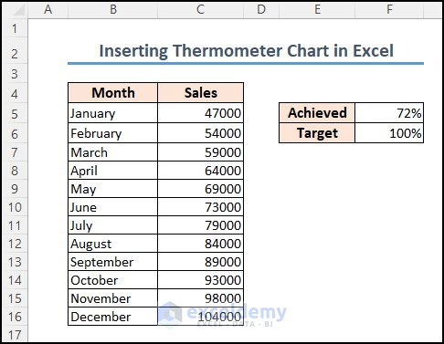
Step 01: Prepare the Dataset
Following is the dataset I have prepared for creating a thermometer chart in Excel. This is a sales dataset where Achieved and Target percentages are given.
Step 02: Insert 2-D Clustered Column
- Initially, select cell F5:F6 and click the Insert tab.
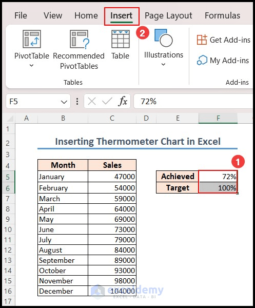
- Then, from 2-D Column, select Clustered Column.
- Thus, clustered column chart with the selected data is created.

- From the Chart Design tab, click on Switch Row/Column.
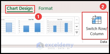
- Hence the Row/Column has switched.
- Now, delete the Chart Title and Gridlines.
Step 03: Format Data Series
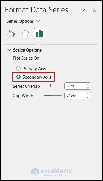
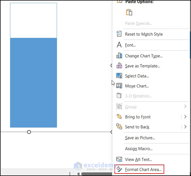
- First, right-click on any column of the chart.
- Secondly, click on Format Data Series.

- Format Data Series pane will appear.
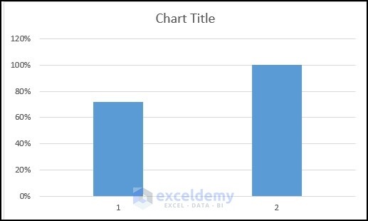
- Afterward, select Secondary Axis from Series Options.
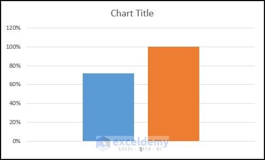
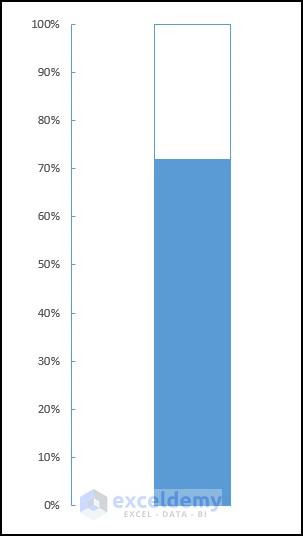
- As a result, the chart will look like the following image.

Step 04: Format Axis
- To begin, right-click on the vertical axis of the left side.
- Then, select Format Axis.
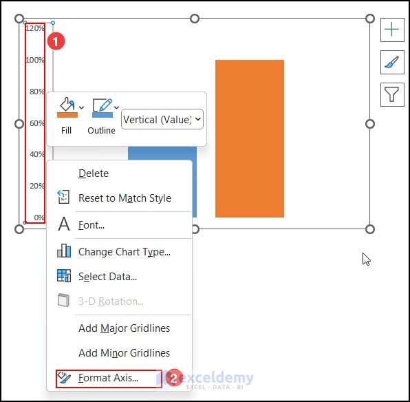
- Now, set the Minimum bound to 0 and Maximum bound to 1.0.

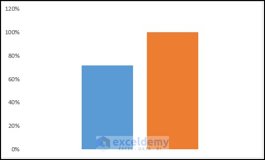
- Consequently, you can see that the maximum value of the vertical axis is now 100%.

Step 05: Change Fill and Border Option
- Right-click on the orange column which is Series 2.
- Then select the Fill option.
- Select No Fill.
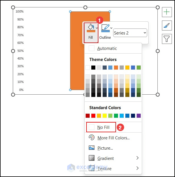
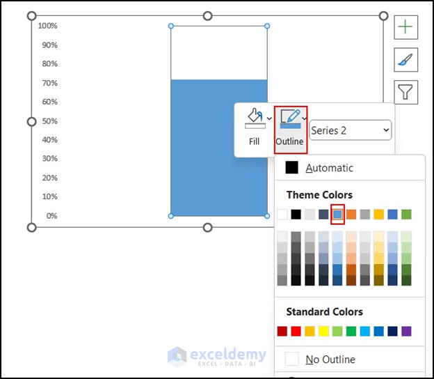
- Now, select the Outline option and select the same color as Series 1 column.
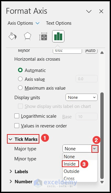
Step 06: Put the Tick Marks Inside from Format Axis
- Again, right-click on the left vertical axis.
- Then, click on Format Axis.
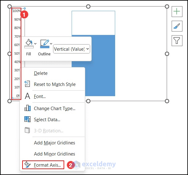
- Thus, Format Axis pane will appear.
- Under the Tick Marks option, click on the dropdown beside the Major type.
- Choose the Inside option for Major type Tick Marks.

- As a result, the vertical axis will look like the given image. Tick marks are placed inside.
Step 07: Format Chart Area
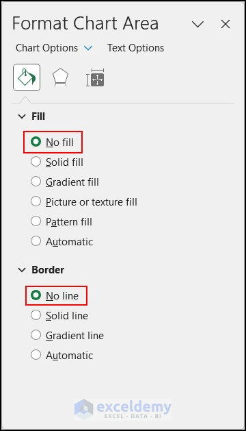
- First, right-click on the chart outline and select Format Chart Area.
- Hence, the Format Chart Area pane will appear.
- Click on No fill for Fill And select No line for Border.
- This will make the border of the chart invisible, and your thermometer chart will look clear.
Step 08: Insert Shape
- Click on the Insert tab.
- From Illustrations, select Shapes and choose the oval shape marked on the picture.
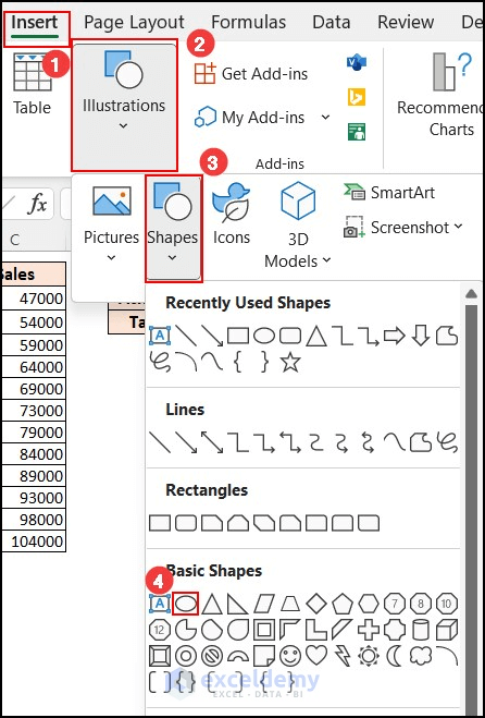
- Now, by dragging the cursor on the worksheet, create a circle from the oval shape.
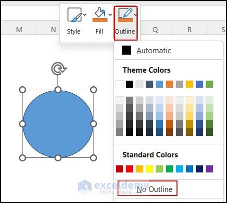
- Right-click on the shape and select Outline.
- Click on No Outline.
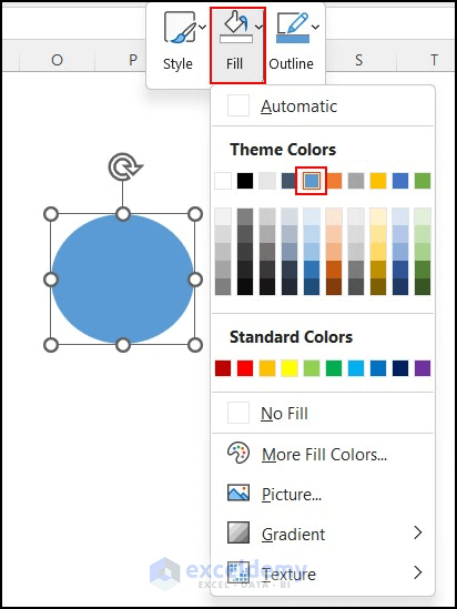
- Then right-click on the shape again.
- Select the Fill option and choose your required color. The color should be the same as the color of the chart.
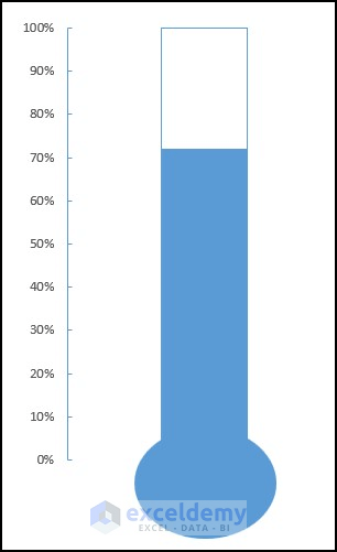
- Lastly, replace the created circular shape at the bottom of the chart so that it will look like a thermometer.
- Your Thermometer chart has been created successfully.

Read More: How to Create a Thermometer Chart in Excel
How to Create a Twin Thermometer Chart in Excel?
A twin thermometer represents targets and goals for two different companies. It is easy to compare the progress of two companies at the same time.
Step 01: Create a Dataset
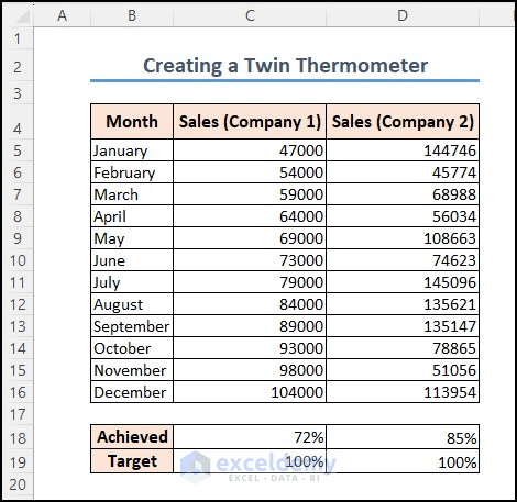
- Initially, I created a dataset that shows Sales of two companies. The percentage of achieved and target should be shown in the dataset.
Step 02: Insert 2-D Clustered Column Chart
- Then, select C18:C19 and click the Insert tab.
- From charts, choose 2-D clustered Column.
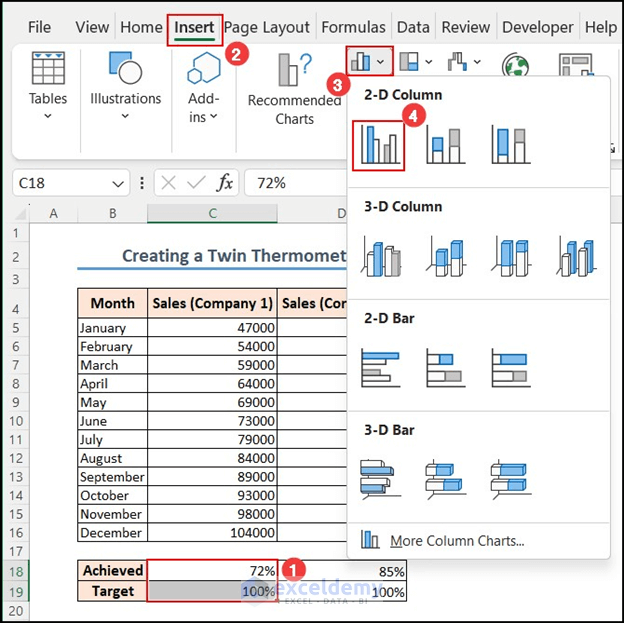
- Therefore, a 2-D clustered column chart is created using the selected data.
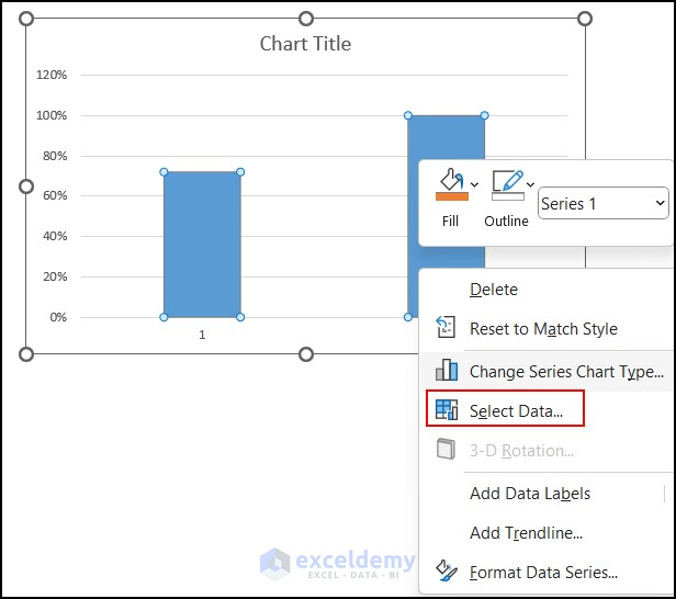
- Right-click on any column of the chart.
- Then, click on Select Data.
Step 03: Select Data Source
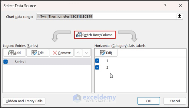
- First, right-click on any column of the chart.
- Now, click on the Switched Row/Column in the Select Data Source dialog box.
- Afterward, click on Add under Legend Entries.
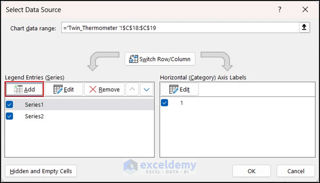
- In Series name, give your preferred name.
- And in Series values, select the cell D18 which contains achieved sales for company 2.
- Lastly, press OK.
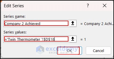
- Therefore, another series has been added in the chart.

Step 04: Format Axis
- At first, right-click on the vertical axis of the left side.
- Then, select Format Axis.
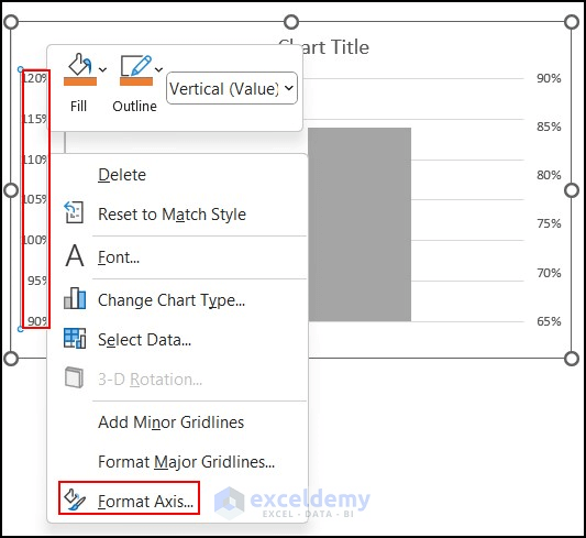
- Now, set the Minimum bound as 0 and Maximum bound as 1.0.
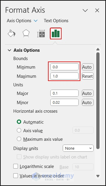
- Consequently, you will see that the maximum value of the vertical axis is now 100%.
Step 05: Format Data Series
- Right-click on the new column (company 2 Achieved).
- Click on Format Data Series.

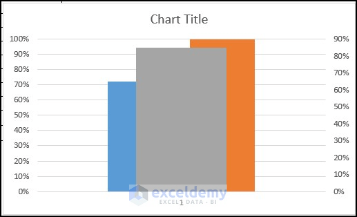
- In the Format Data Series pane, select the secondary axis.
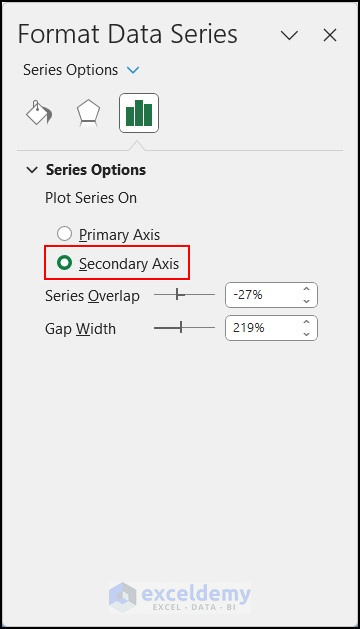
- As a result, the chart will look like the image given below.
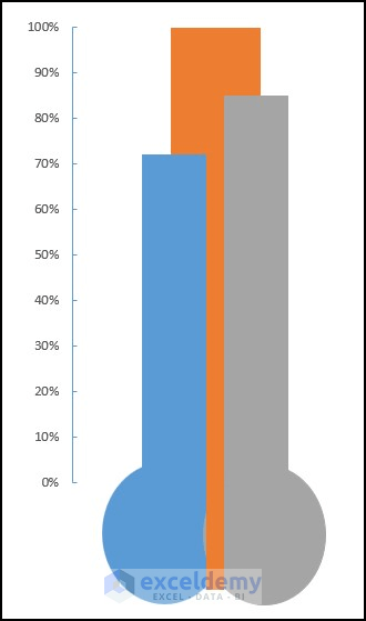
Step 06: Change Series Chart Type
- Again, right-click on the company 2 Achieved column.
- Select Change Series Chart Type.
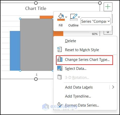
- In the Change Chart Type dialog box, select the Combo option.
- For series 1, put a tick mark under Secondary Axis and press OK.
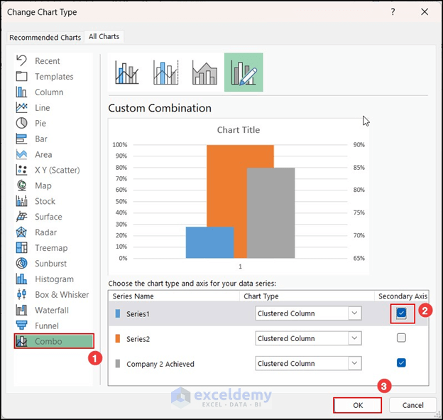
- The chart will look like the following image.
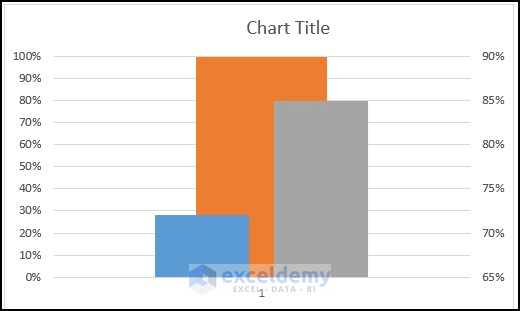
- Now, delete Chart Title, Gridlines and vertical axis of the right side.
- Resize the chart to make it look like a thermometer.
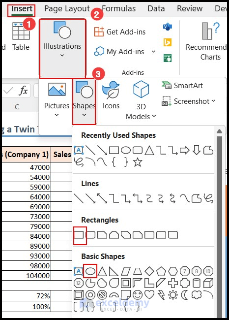
Step 07: Insert Shape from Illustrations
- First, select the Insert tab.
- From Illustrations, select the oval shape.
- After drawing the oval shape, draw a rectangular shape also by following the same steps.
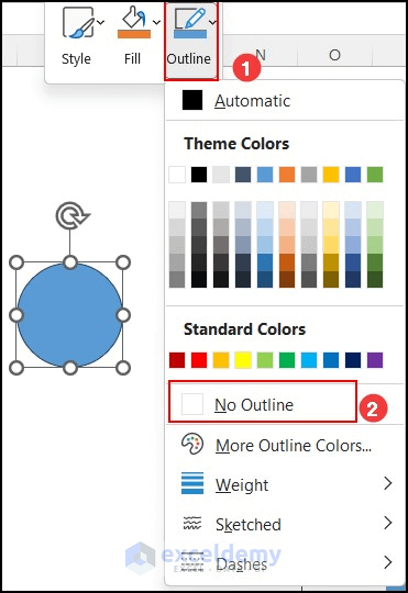
- Now, right-click on the oval shape.
- From outline, select No Outline.
- Select the same fill color as the column of the chart.
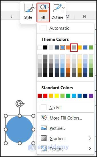
- Copy the oval shape and paste it. Then, change the fill color of it. Choose the color of the Company 1 Achieved chart as the fill color.
- Place the oval shapes under the columns like the following image.
- Lastly, place the rectangle in the middle column of the chart and change the fill color.

Step 08: Format Axis of the Vertical Axis
- Right-click on the vertical axis of the left side of the chart.
- Then, select Format Axis.
- In the Format Axis pane, set Tick Marks of the Major type as Inside.
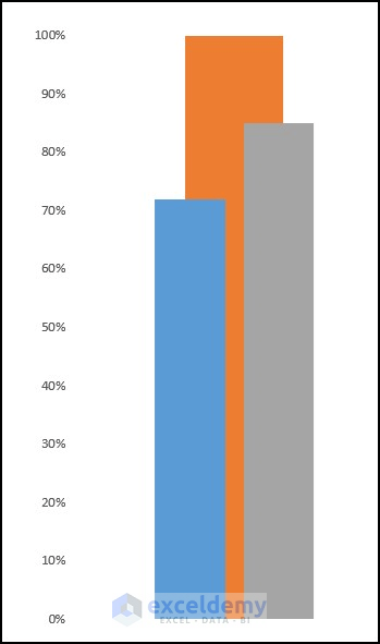
- Therefore, the chart will look like a twin thermometer.
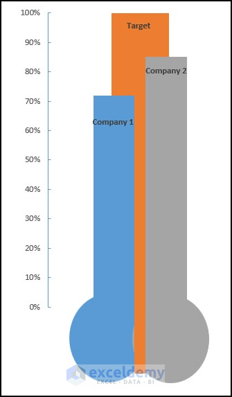
Step 09: Add Data Labels
- Right-click on the column.
- Then select Add Data Labels.
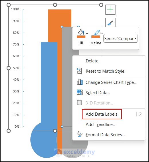
- Edit the data labels of each column.
- So, a twin thermometer chart is created.
What Are the Advantages of Thermometer Chart in Excel?
- Thermometer charts are particularly useful for tracking progress toward a specific target or goal.
- It creates a visual representation of progress. This allows viewers to quickly grasp the information without reading the whole dataset.
- Thermometer charts can be handy to compare multiple data sets or targets.
- Thermometer charts help the user to take a decision quickly. It helps stakeholders, managers, or individuals make informed judgments based on the progress displayed.
Which Things You Have to Keep in Mind?
- Try to keep the chart as simple as possible. It will increase readability.
- Select the data carefully when you are working with a large dataset.
Frequently Asked Questions
1. Which chart shows temperature?
Answer: The chart that shows temperature is a line chart. Line charts are commonly used to display continuous data. And they are often used to track temperature variations over a specific period. In a line chart, temperature values are plotted on the y-axis. The corresponding time intervals (such as hours, days, or months) are plotted on the X-axis.
2. What is Gantt Excel?
Answer: A Gantt chart is a visual representation of a project schedule. It displays the start and end dates of individual tasks or activities. Gantt Excel provides a user-friendly interface within Excel. We can easily create and customize Gantt charts to plan, track, and manage project timelines.
3. How do you calculate the minimum bounds value for a thermometer?
Answer: To calculate the value of the minimum bound for a thermometer chart, you need to determine the lowest value of your dataset. It will be represented at the bottom of the thermometer. The minimum bounds value is the lowest value you want to display on the chart.
4. How to make a bar chart?
Answer: Select the data first. Then click on the Insert tab. Then select the Recommended Charts option. From Insert Chart dialog box, select All Charts. Then click on Bar and select your desired type of bar chart. Lastly, press the OK button.
Conclusion
I hope this article has helped you to learn how to create a thermometer chart in Excel. I showed the detailed steps of creating thermometer chart or goal thermometer and twin thermometer. You can compare two companies or individuals by creating a twin thermometer chart as well. However, you can modify the design of the chart according to your requirements. Please leave a comment if you have any questions about this topic.
Thermometer in Excel: Knowledge Hub
- How to Create Progress Thermometer in Excel
- How to Create Goal Thermometer in Excel
- How to Create Fundraising Thermometer in Excel
- How to Create Debt Thermometer in Excel
<< Go Back To Excel Charts | Learn Excel

