Error bars represent uncertainty and variability in data. They provide a visual indication of measurement uncertainty, statistical significance, comparative analysis, confidence intervals, trend analysis, and enhanced data communication. By assessing the range, overlap, and lengths of error bars, researchers can make reliable conclusions, informed decisions, and effectively communicate results.
Starting with the process of adding different types of default error bars, this article introduces the process of adding custom error bars. Though horizontal error bars are not as common as vertical ones, you will also learn to add them to your graphs.
We also cover the method of applying error bars to specific data series along with creating individual error bars of different lengths to make data representation more precise and controlled.
You will also learn to customize the error bars you just added in order to make your chart more attractive and distinguishable.
Lastly, this article will equip you with the skill to remove error bars when necessary to maintain data clarity.
Here we have used Excel 365 to show you these error bar-related procedures.
Download Practice Book
What Is Error Bar?
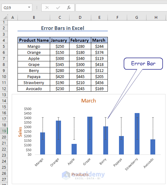
In Excel, an error bar is a graphical representation used to display the variability or uncertainty associated with data points in a chart.
Error bars can be based on various statistical measures, such as standard deviation, standard error, confidence intervals, or custom values.
What Are the Default Error Bars in Excel?
There are three types of error bars that Excel offers us by default. They are:
Standard Error: The standard error indicates how much the sample mean is likely to deviate from the population mean. It is typically represented as the standard deviation divided by the square root of the sample size.
Percentage: Percentage error bars are calculated by taking the absolute difference between the two values, dividing it by the reference value, and multiplying by 100 to express it as a percentage.
Standard Deviation: The standard deviation provides a measure of how spread out the data is from the mean. A larger standard deviation indicates a greater dispersion, while a smaller standard deviation indicates less variability.
How to Add Error Bars in Excel?
The processes of adding each type of error bar are given below.
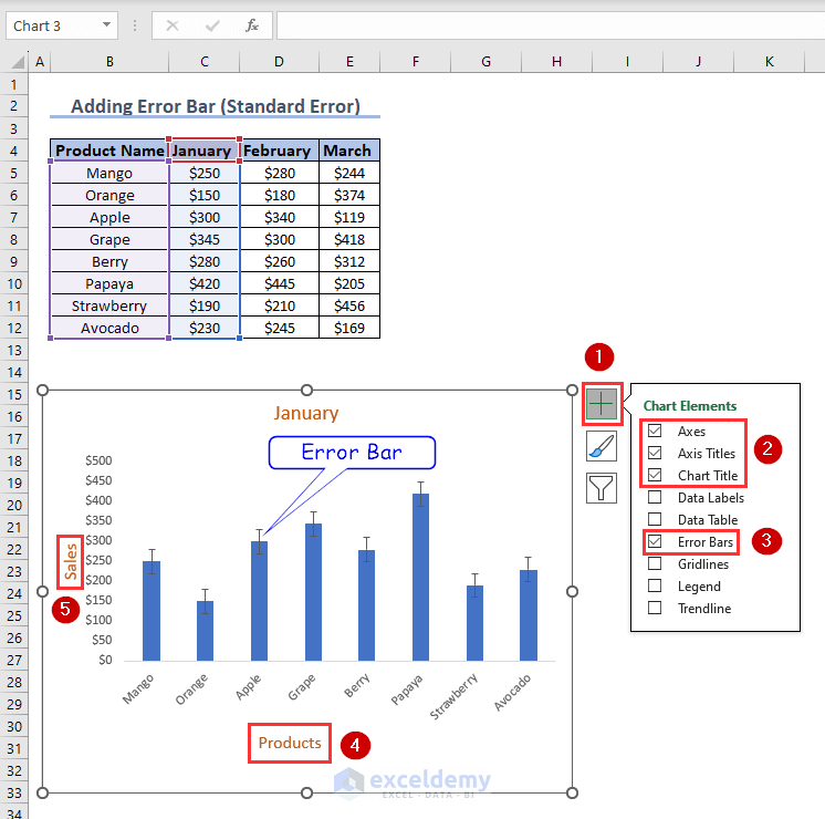
How to Add Standard Error Bars?
To add standard error bars, follow the steps below:
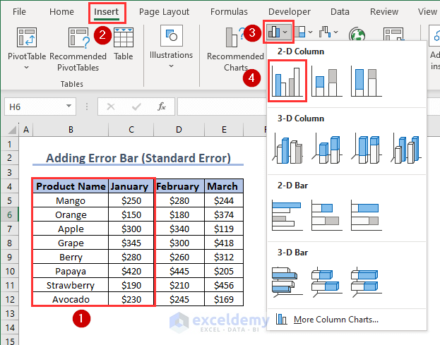
- First, select two columns. Then click Insert >> Insert Column or Bar Chart >> Clustered Column.
The chart is inserted.
- Now click on Chart Elements. Select Axes, Axis Titles, Chart Title and Error Bars. Deselect Gridlines. Appropriately rename the axis titles.
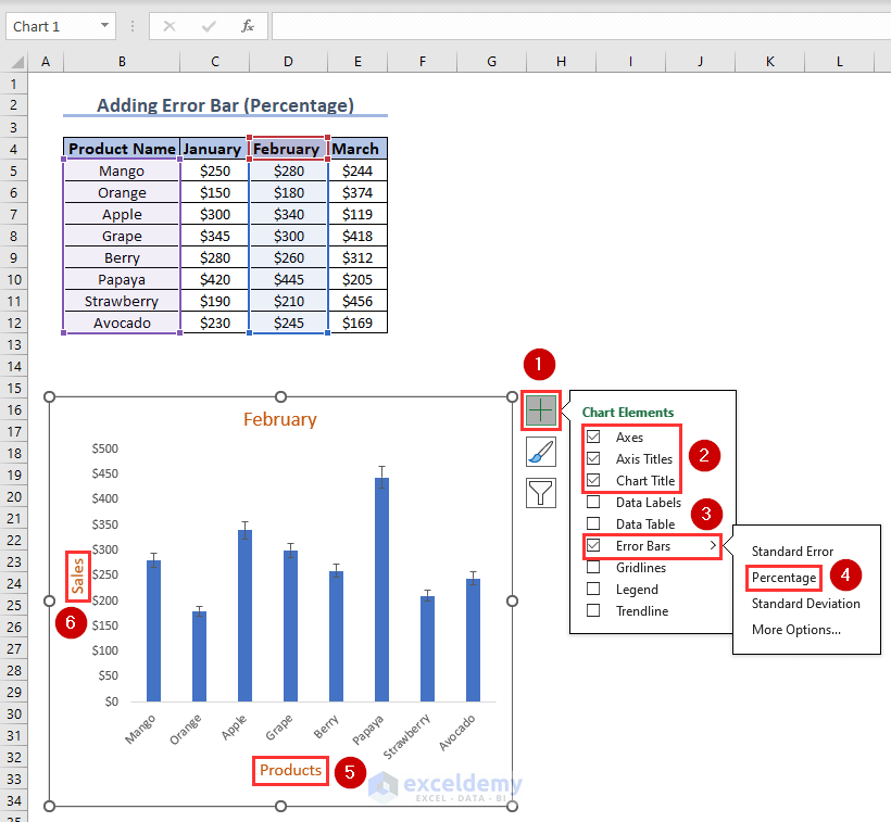
How to Add Percentage Error Bars?
To add percentage error bars, follow the steps below:
- Insert a clustered column chart as mentioned before.
- From the error bars options select Percentage. Rename the axis titles as before.
Click the image for a detailed view
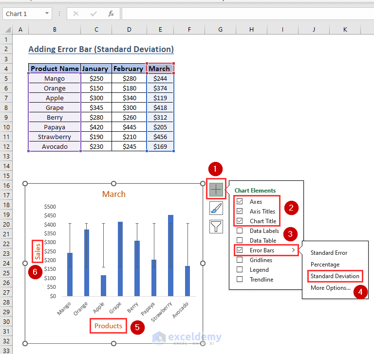
How to Add Standard Deviation Error Bars?
To add standard deviation error bars, follow the steps below:
- Insert a clustered column chart as mentioned before.
- Then, repeat the process by selecting Axes, Axis Titles, Chart Title, Error Bars, and deselecting Gridlines from Chart Elements. Now, from the error bars options select Deviation. Rename the axis titles as before.
How to Add Custom Error Bars in Excel?
To add custom error bars, follow the steps below:
- First, Insert a clustered column chart as mentioned before.
- Then, from Chart Elements select Axes, Axis Titles, Chart Title, Error Bars, and deselect Gridlines.
- From the Error Bars option select More Options…
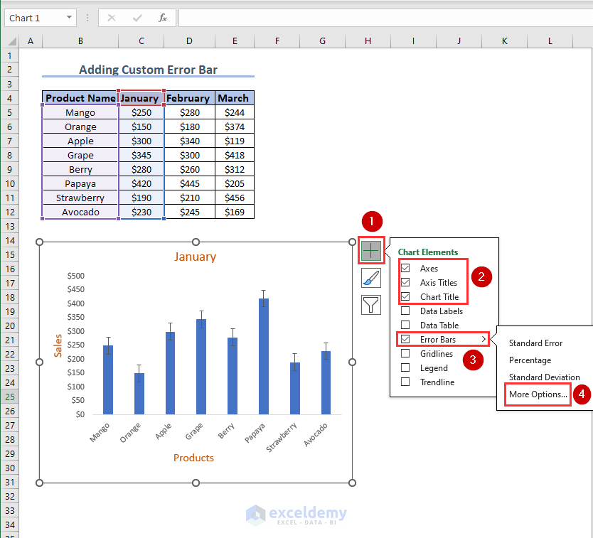
Click the image for a detailed view
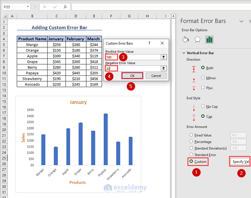
- Subsequently, select Custom from Error Bar Options. Click on Specify Val. A dialogue box will appear.
- Type the Positive and Negative error values as you see fit inside the respective boxes. Sometimes it is possible that you don’t want any one of the two error values and keep the other one. Simply put 0 in the error value box that you do not want.
- Press OK.
Click the image for a detailed view
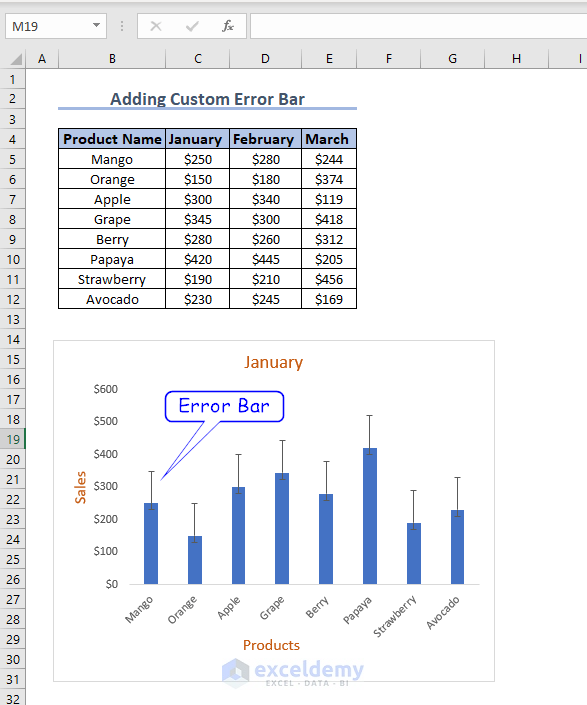
You can now see the custom error bars inside your bar chart.
How to Add Horizontal Error Bars in Excel?
To add horizontal error bars, follow the steps below:
- First, select the Product Name column and any of the month columns by pressing CTRL.
- Then, click Insert >> Insert Column or Bar Chart >> Clustered Bar.
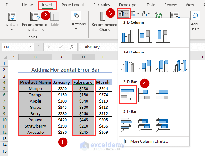
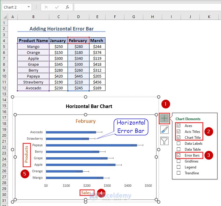
- Then, inside Chart Element, select Axes, Axis Titles, Chart Title, Error Bars, and deselect Gridlines. Rename the axis titles appropriately.
There is your horizontal error bar.
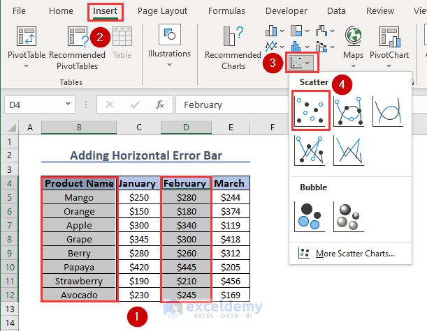
Now, if you want to add this horizontal error bar on a scatter plot instead of a bar graph,
- First, select two columns and insert a Scatter plot.
- Then, inside Chart Element, select Axes, Axis Titles, Chart Title, Error Bars, and deselect Gridlines.
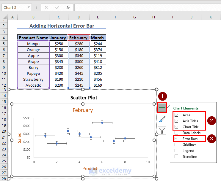
- Afterward, select and right-click on the vertical part of any of the error bars and click on Delete.
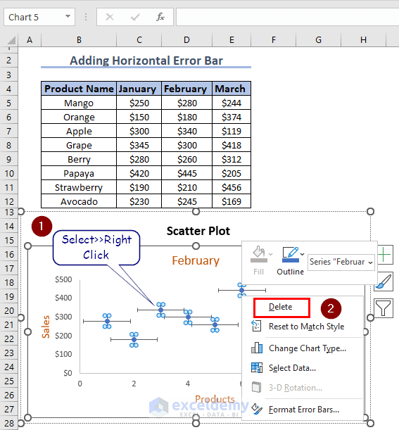
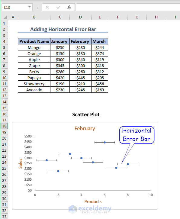
The process leaves you with only the horizontal portions of your error bars.
How to Add Individual Error Bars of Different Lengths?
Excel assigns a single number to all of the data points when using any of the built-in error bar choices, including standard error, percentage, and standard deviation. However, there are some circumstances where you would want to have your own determined error values on specific points.
To add individual error bars of different lengths, follow the steps below:
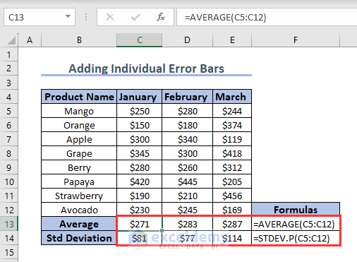
- First, create two extra rows to your dataset, for the average sales per month and standard deviation. Inside cell C13, put the following formula:
=Average(C5:C12)- Press Enter and use Flashfill to the rightmost column.
- Then, inside cell C14, type the following formula:
=STDEV.P(C5:C12)- Similarly, press Enter and use Fill Handle.
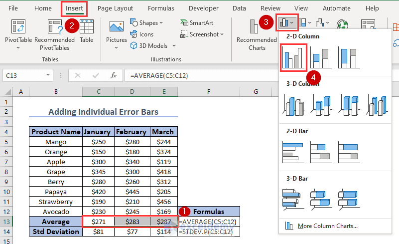
- Now, select the range C13:E13 and insert a column chart as before.
Click the image for a detailed view
- From the Chart Elements select Axes, Axis Titles, Chart Title, Error Bars, and deselect Gridlines.
- Click on More Options…

Click the image for a detailed view
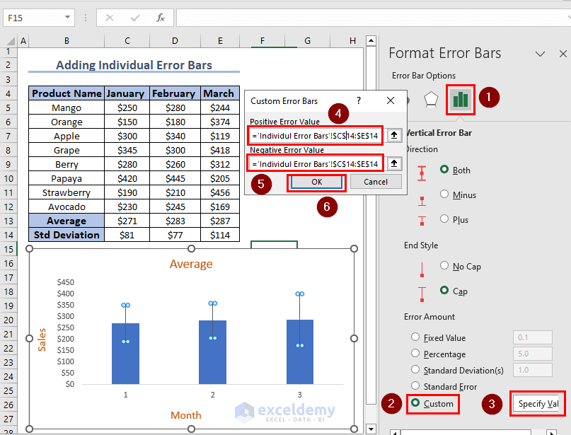
- Under Error Bar Options, select Custom and Click on Specify Val.
- Then, inside both positive and negative error value boxes, specify input range $C$14:$E$14.
- Press OK.
Click the image for a detailed view
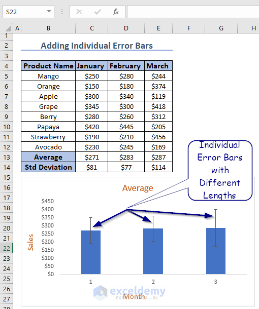
All the error bars are now of different lengths according to their corresponding standard deviation.
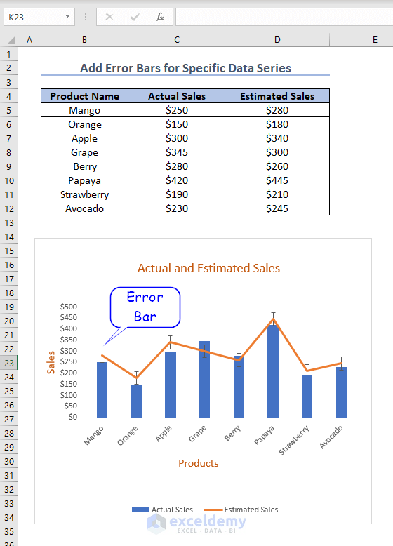
How to Add Error Bars for a Specific Data Series?
Frequently, It is wise to add error bars to just one series in a combination chart.
To add error bars for a specific data series, follow the steps below:
- First, select the entire data table. Click on Insert >> Recommended Charts >> All Charts >> Combo >> OK.
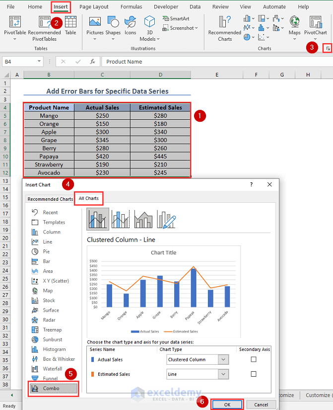
- Now, select the series that you want to add error bars. In this case, I have selected the line chart.
- Under Chart Elements select Axes, Axis Titles, Chart Title, Error Bars, and deselect Gridlines. Rename the chart title and axis titles accordingly.
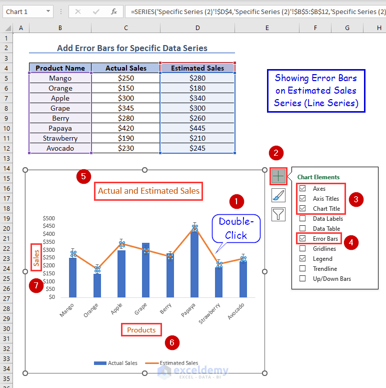
You can now see that error bars are added to the series of your choice inside a single chart.
How to Customize Error Bars in Excel?
To customize error bars in Excel, double-click on the error bars. Format Error Bars window will open. Under the Fill & Line section, you can see all the customization options. Customize the error bars as you desire using the options. Here I have changed the Color, Width, and Cap type of the error bars.
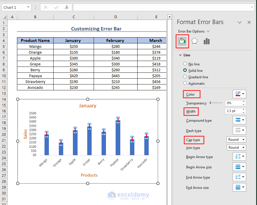
Click the image for a detailed view
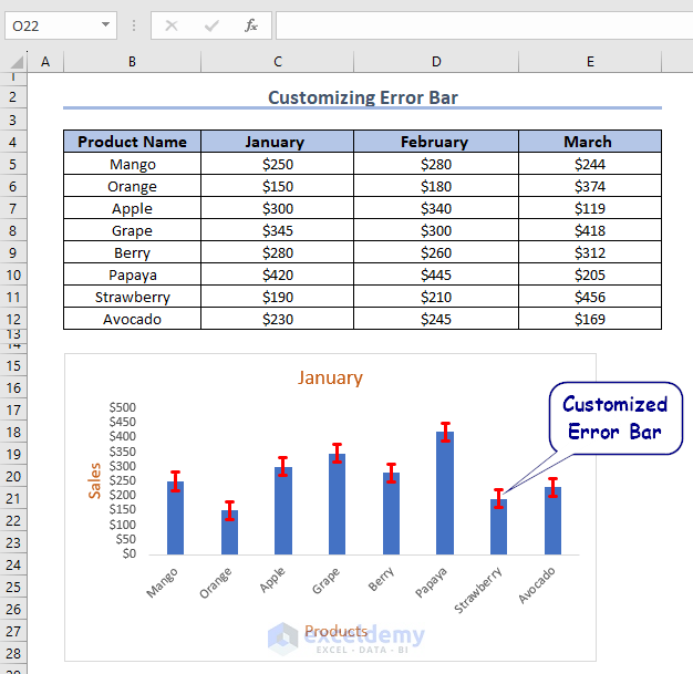
See the look of a customized error bar.
How to Delete Error Bars?
If you want to delete error bars entirely,
- Click anywhere on the chart and select Chart Elements.
- Then uncheck the Error Bars check box to remove all error bars from your graph.
Again, if you want to remove error bars from a specific data series,
- Click on the series.
- Then from Chart Elements uncheck the Error Bars box to remove the error bars for that specific data series from the chart.
You can also remove the “extras” from a data series that has both vertical and horizontal error bars by right-clicking the extraneous bars and selecting Delete from the context menu.
What Are the Things to Keep in Mind?
- When presenting data with error bars, ensure that you use consistent error bar settings across different charts or data series. This promotes clarity and allows for easier comparisons between data points.
- Avoid making definitive conclusions solely based on the error bars. Always consider the context, study design, and statistical analysis when interpreting the implications of the error bars.
- To enhance the visual appeal of your error bars in Excel, explore customization options such as different line styles, colors, and cap styles. These adjustments can help make your error bars more distinct and easier to interpret within your charts.
Conclusion
By going through this article, I am confident that you have developed a strong understanding of how to use the power of error bars in Excel. From the foundational process of adding different types of error bars to the techniques of customizing them, you have now gained the expertise to improve the ability of data visualizations and navigate uncertainties effectively.
Adding error bars to your graphs not only refines the representation of data variability but also simplifies the interpretation of your charts. These error bars serve as bridges, connecting the gaps between data points and contributing to the efficiency of both data analysis and presentation.
Frequently Asked Questions
1. What do error bars mean?
Answer: Error bars in a chart represent the variability or uncertainty associated with the data points being plotted. They provide a graphical depiction of the potential error or variation in the measurements or calculations.
2. What is the error bar range?
Answer: The specific range of the error bars depends on the type of error bars being used and the statistical measure they represent.
3. What do 95% error bars mean?
Answer: A 95% confidence limit implies that there is a mere 5% probability that the true value lies outside the range defined by the error bar.
Error Bars in Excel: Knowledge Hub
<< Go Back To Excel Chart Elements | Excel Charts | Learn Excel

